The Scene Club is a private film club in Dubai that showcases the best of world independent cinema.
The Scene Club is a private film club in Dubai that showcases the best of world independent cinema.
COMPANY
COMPANY
Tigerspike
Tigerspike
ROLE
ROLE
Senior UX/UI Designer
Senior UX/UI Designer
SKILLS
SKILLS
Lean UX Methodology, Personas, Sketching, High-Fidelity Prototyping, Android Native
Lean UX Methodology, Wireframing, High-Fidelity Prototyping, Native Mobile UI
PROBLEM
PROBLEM
The Scene Club wanted an app to aid in the promotion of their annual festival, foster the club's image of creativity and innovation, and create a product that streamlines the exploration, selection, purchase, and check-in process. After conducting some research they have found a large number of their viewers are Android users, so they have decided to lead with an Android design.
The Scene Club wanted an app to aid in the promotion of their annual festival, foster the club's image of creativity and innovation, and create a product that streamlines the exploration, selection, purchase, and check-in process. After conducting some research they have found a large number of their viewers are Android users, so they have decided to lead with an Android design.
DISCOVERY
DISCOVERY
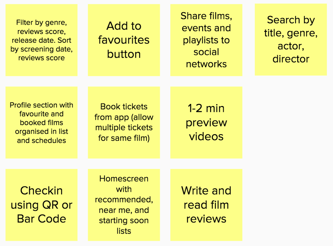
The phase of discovery was composed of Ideation Sessions where assumptions and hypotheses were discussed and created. The involvement of different perspectives like designers, product owners, developers and clients, is very important.
The project kicked off by starting to raise by he above business and user assumptions. They were then classified and distributed in a grid that maps certainty and risk.
BUSINESS ASSUMPTIONS
BUSINESS ASSUMPTIONS
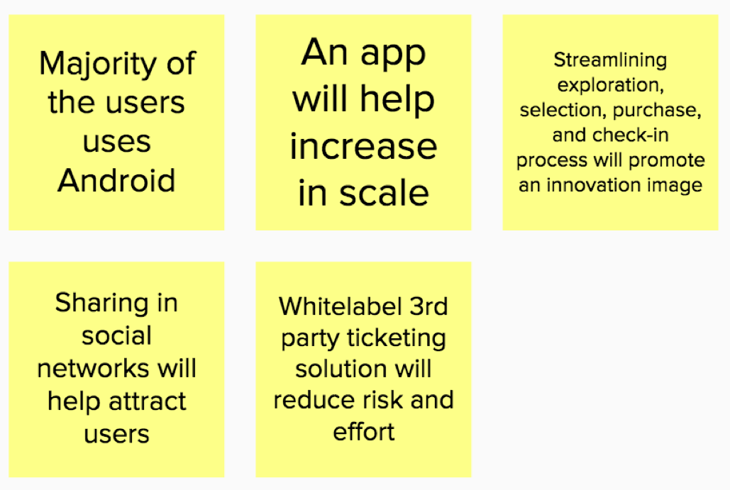
USER ASSUMPTIONS

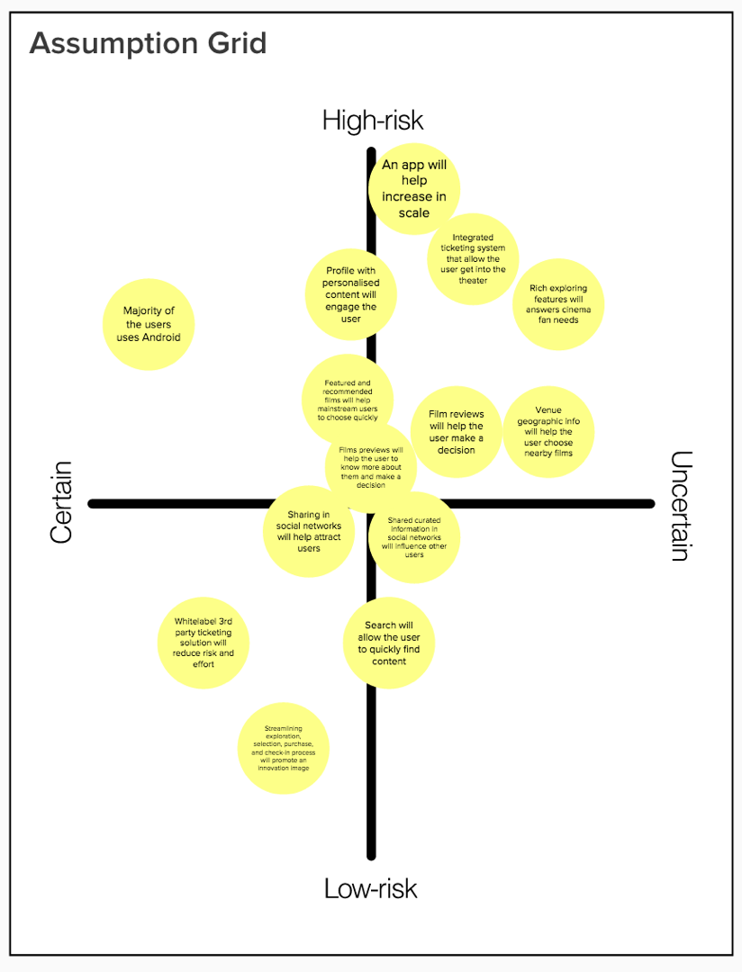
ASSUMPTIONS GRID
USER OUTCOMES
USER OUTCOMES
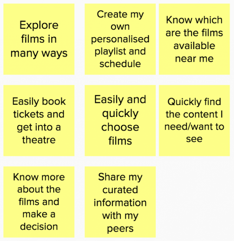
It was then time to look at the users' needs and problems we are trying to solve, look at the user assumptions made and put together a list of user outcomes.
It was then time to look at the users' needs and problems we are trying to solve, look at the user assumptions made and put together a list of user outcomes.
BUSINESS METRICS
BUSINESS METRICS
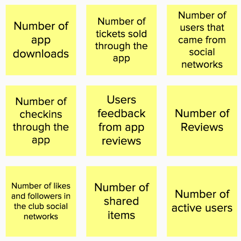
Similarly, taken into consideration the business assumptions, metrics were raised in order to measure the user outcomes and their success.
Similarly, taken into consideration the business assumptions, metrics were raised in order to measure the user outcomes and their success.
PROTO-PERSONAS
PROTO-PERSONAS
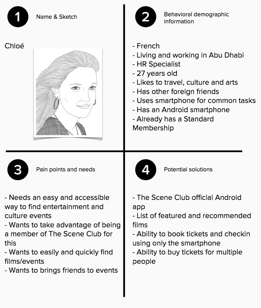
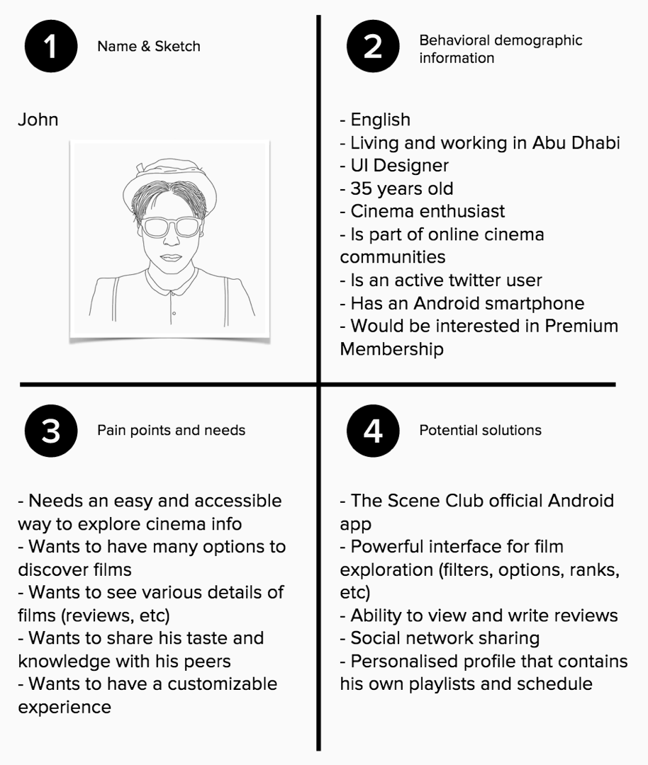
After the definition of the User Outcomes and Business Metrics, the sessions focused on proto-personas. Proto-personas are the models of the users that will have the assumed needs and want the created outcomes.
After the definition of the User Outcomes and Business Metrics, the sessions focused on proto-personas. Proto-personas are the models of the users that will have the assumed needs and want the created outcomes.
FEATURES
FEATURES
It was then time to take a look at the assumptions, review the desired outcomes, relate them to the personas and their needs, behaviours and potential solutions and start suggesting and discussing features.
It was then time to take a look at the assumptions, review the desired outcomes, relate them to the personas and their needs, behaviours and potential solutions and start suggesting and discussing features.
HYPOTHESIS
HYPOTHESIS
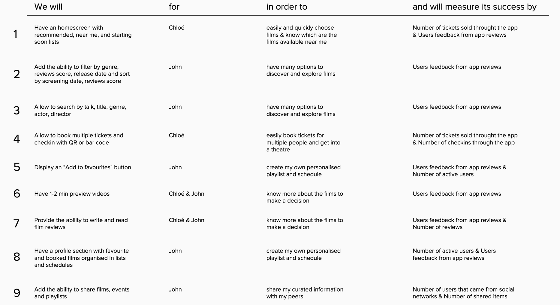
The last piece of this discovery phase, was the conception of the hypothesis. Using the outcomes, metrics, personas and features as building blocks, the following testable hypotheses were created.
The last piece of this discovery phase, was the conception of the hypothesis. Using the outcomes, metrics, personas and features as building blocks, the following testable hypotheses were created.
IMPLEMENTATION
IMPLEMENTATION
Building user journeys is a great way to materialise the hypothesis into a mobile user interface. These user journeys are created to address each of the personas' needs. The following wireflows (user flows built with wireframes), were then created to address these two journeys' requirements.
Building user journeys is a great way to materialise the hypothesis into a mobile user interface. These user journeys are created to address each of the personas' needs. The following wireflows (user flows built with wireframes), were then created to address these two journeys' requirements.
CHLOE'S JOURNEY
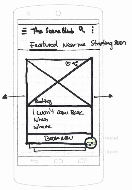
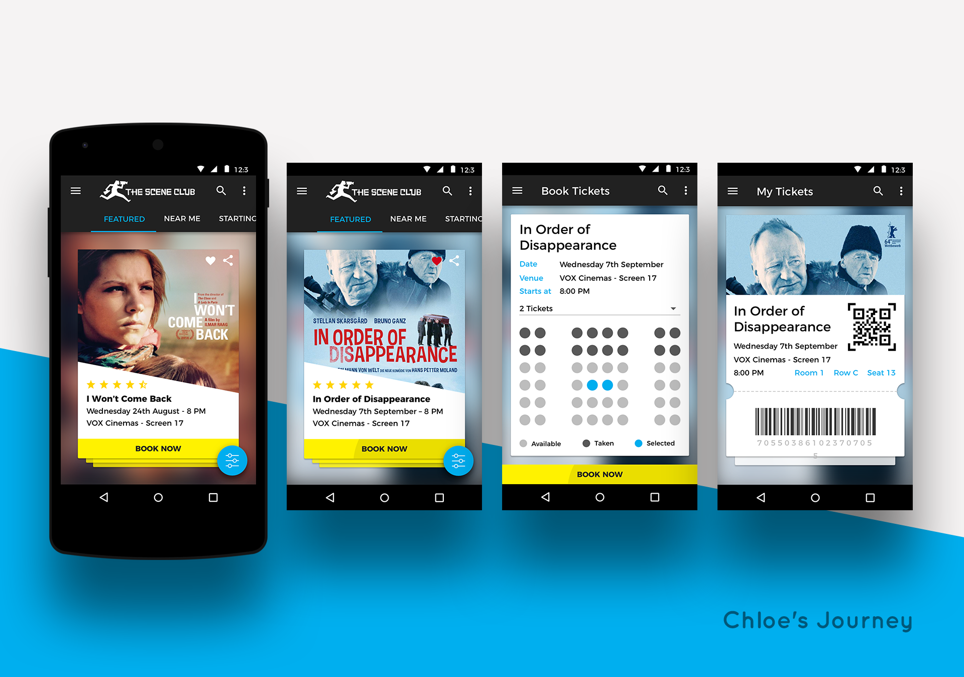
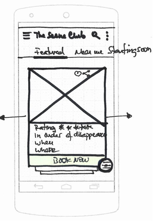
1. Chloe opens the app to look for a film to watch with a friend. The app shows a deck of film cards with a CTA to book and tabs for Featured, Near Me and Starting Soon.
1. Chloe opens the app to look for a film to watch with a friend. The app shows a deck of film cards with a CTA to book and tabs for Featured, Near Me and Starting Soon.
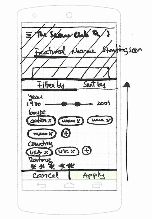
2. Chloe wants to filter the films according to her preferences. She can toggle the filters' panel with controls to filter by year, genre, country and rating .
2. Chloe wants to filter the films according to her preferences. She can toggle the filters' panel with controls to filter by year, genre, country and rating .
3. Chloe applies the selected options and the pp lists filtered films.
3. Chloe applies the selected options and the pp lists filtered films.
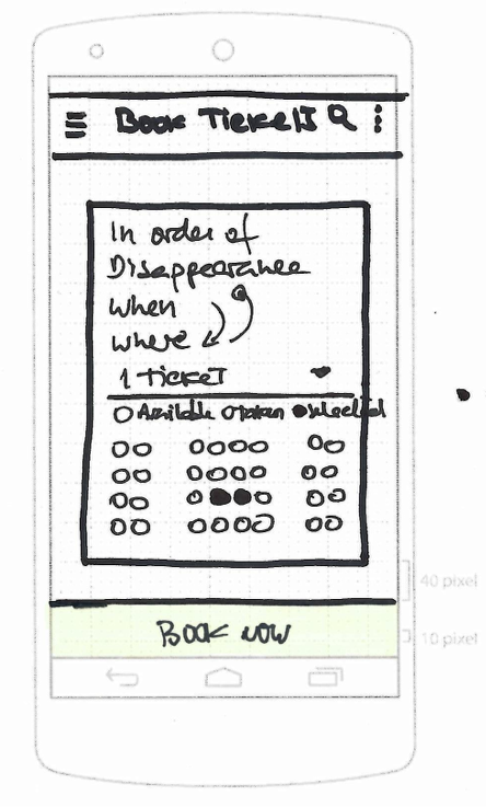
4. Chloe proceeds to book tickets and is shown the booking screen with general info about the film. This screen also allows to select the number of tickets and provides the room layout with the ability to choose seats
4. Chloe proceeds to book tickets and is shown the booking screen with general info about the film. This screen also allows to select the number of tickets and provides the room layout with the ability to choose seats
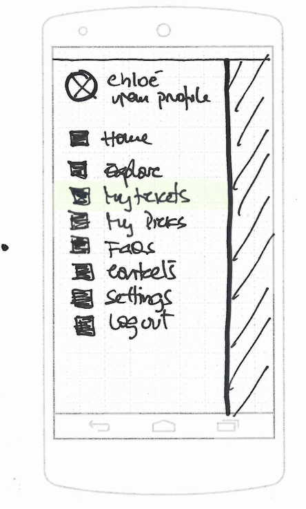
5. When Chloe arrives at the cinema, she opens the app and accesses the purchased tickets from the side menu.
5. When Chloe arrives at the cinema, she opens the app and accesses the purchased tickets from the side menu.
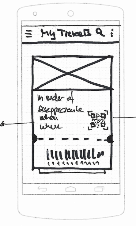
6. The my tickets section contains all purchased tickets with all relevant info and bar / qr code to check in.
6. The my tickets section contains all purchased tickets with all relevant info and bar / qr code to check in.
JOHN'S JOURNEY
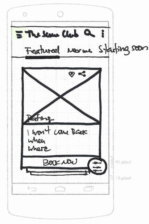
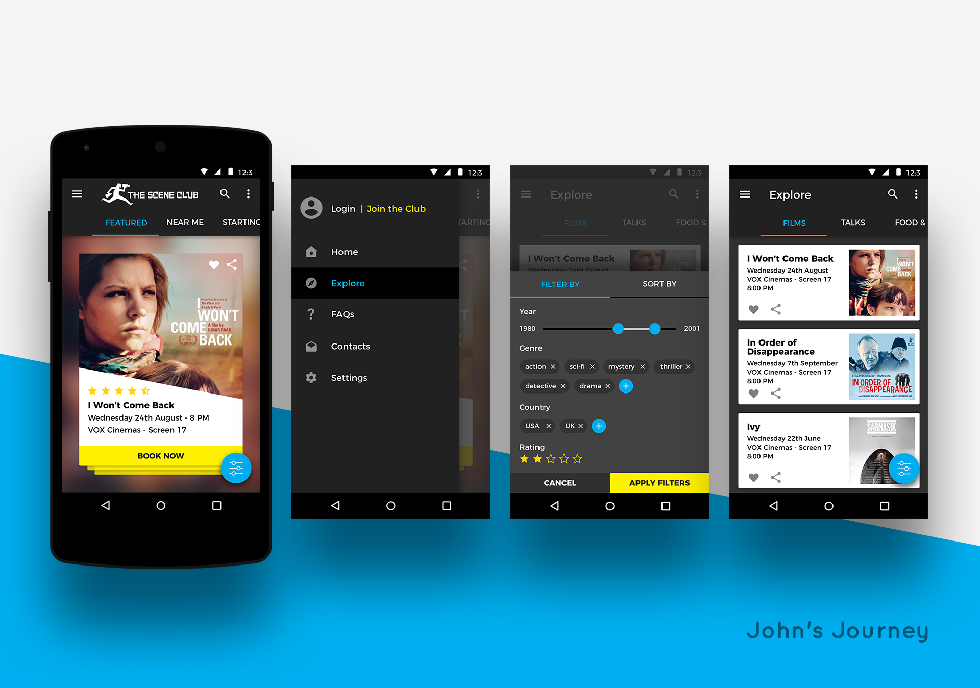
1. John, a cinema savvy user, has the ability to quickly share or save any film. He can also search for films, actors, talks, etc.
1. John, a cinema savvy user, has the ability to quickly share or save any film. He can also search for films, actors, talks, etc.
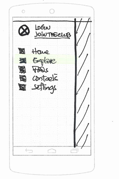
2. The side menu, in the logged out state, looks slightly different, with suggestions to join the club or login. John is curious and selects the explore option.
2. The side menu, in the logged out state, looks slightly different, with suggestions to join the club or login. John is curious and selects the explore option.
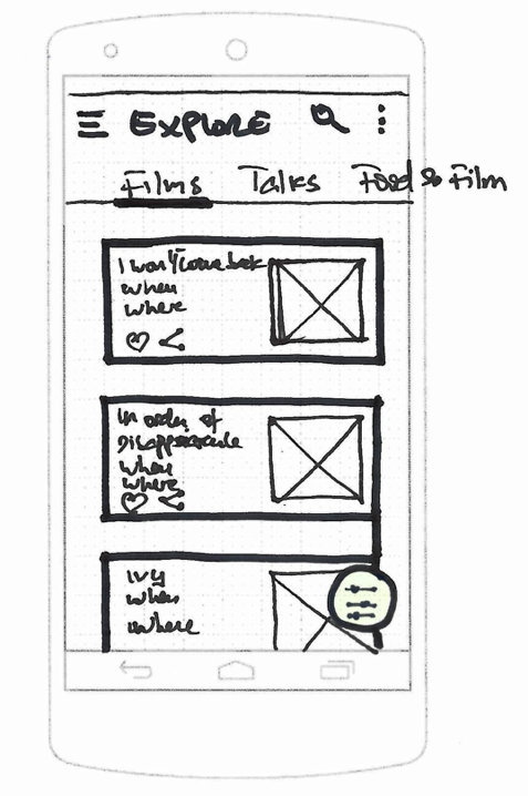
3. The app presents John a list with all available films, with tabs for other events such as Talks, or Food and Film. John is also able to filter or search.
3. The app presents John a list with all available films, with tabs for other events such as Talks, or Food and Film. John is also able to filter or search.
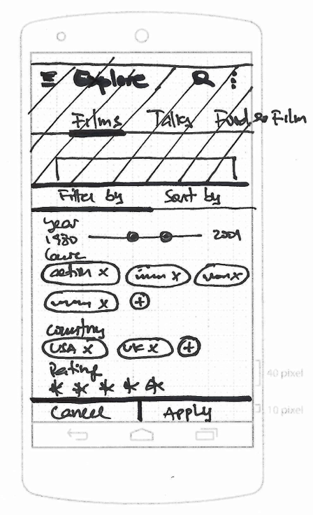
4. John toggles the filter panel, where he also has the option to sort films by different criteria.
4. John toggles the filter panel, where he also has the option to sort films by different criteria.
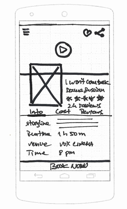
5. Upon selecting a film, the app takes John to the film details screen, that contains a quick preview video and extensive film information, including title, place, time, storyline, cast and more.
5. Upon selecting a film, the app takes John to the film details screen, that contains a quick preview video and extensive film information, including title, place, time, storyline, cast and more.
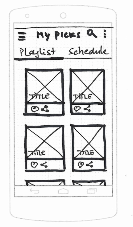
6. John can also access the My Picks section with all his saved films on a playlist or schedule format. He is also able to share individual films or whole playlists (button at bottom)
6. John can also access the My Picks section with all his saved films on a playlist or schedule format. He is also able to share individual films or whole playlists (button at bottom)
OUTCOMES
OUTCOMES
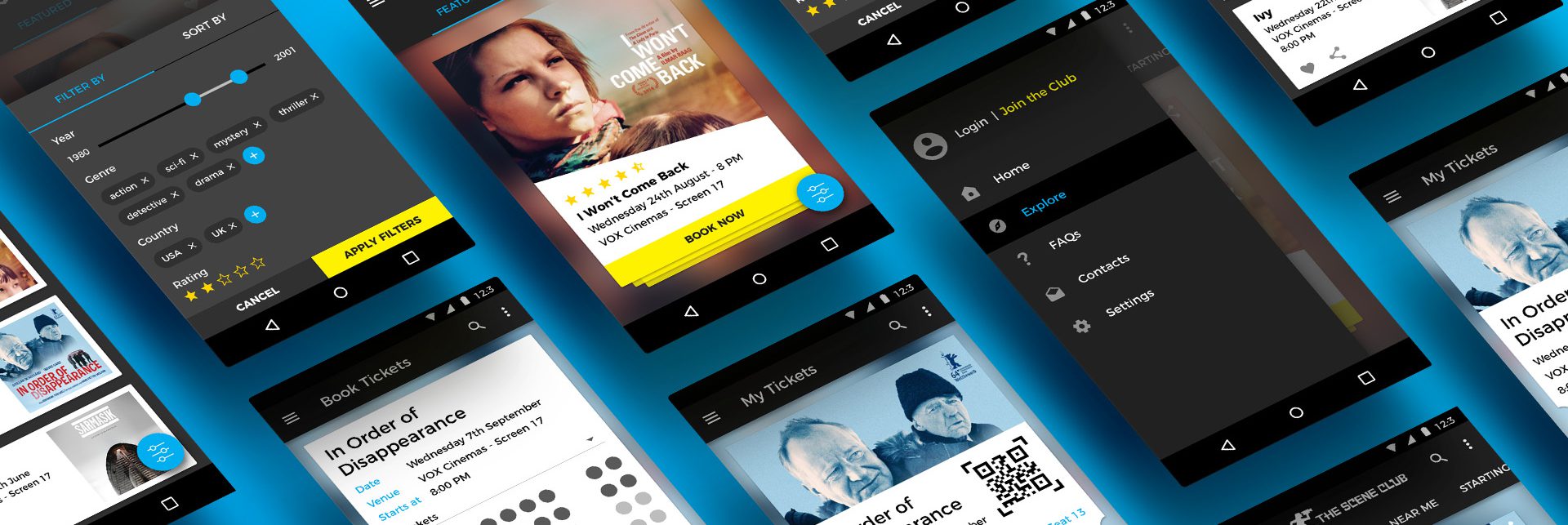
The wireframes were then translated to visual designs. As it was an Android app, it was important to use and follow Google's Material guidelines. However, there was an effort to keep the club's identity in the app, and have a bit of visual disruption to stray away from generic Material apps.
The wireframes were then translated to visual designs. As it was an Android app, it was important to use and follow Google's Material guidelines. However, there was an effort to keep the club's identity in the app, and have a bit of visual disruption to stray away from generic Material apps.
STYLE GUIDE
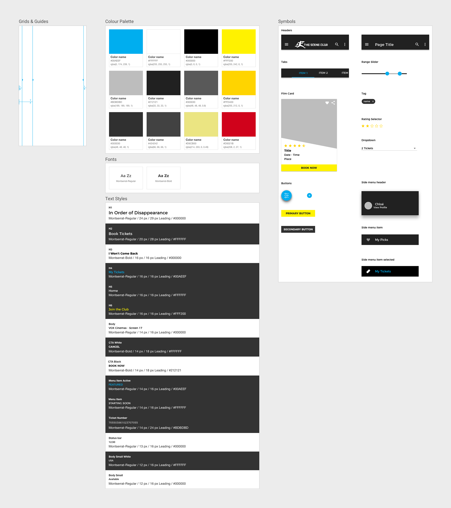
As the visuals are targeted for an application it was essential to build a Style Guide, to act as a reference for developers and also for future iterations.
As the visuals are targeted for an application it was essential to build a Style Guide, to act as a reference for developers and also for future iterations.
SELECTED WORKS

UpholdProduct Design
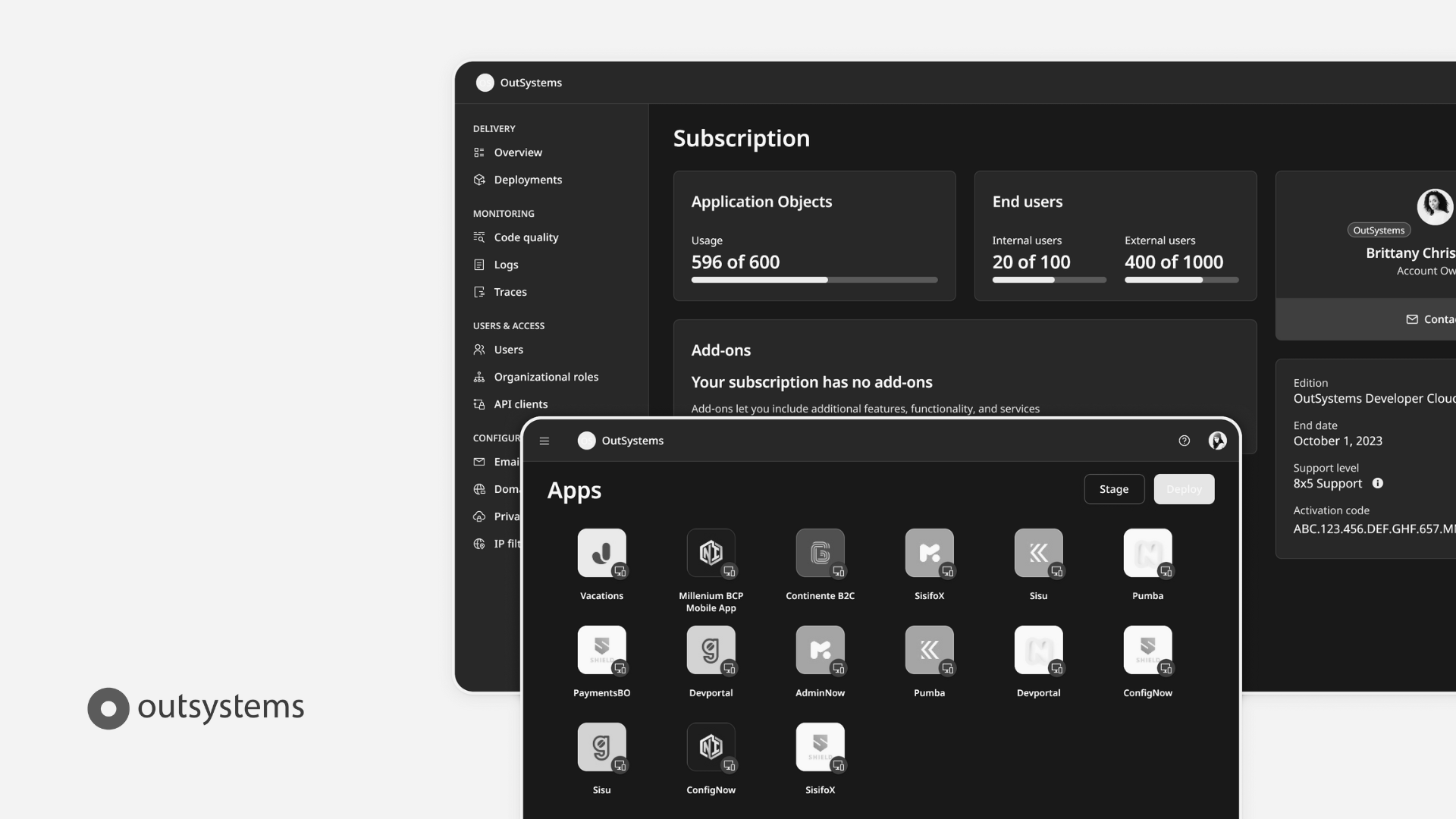
OutsystemsDesign Leadership, Design Operations, Design Systems & Research Ops
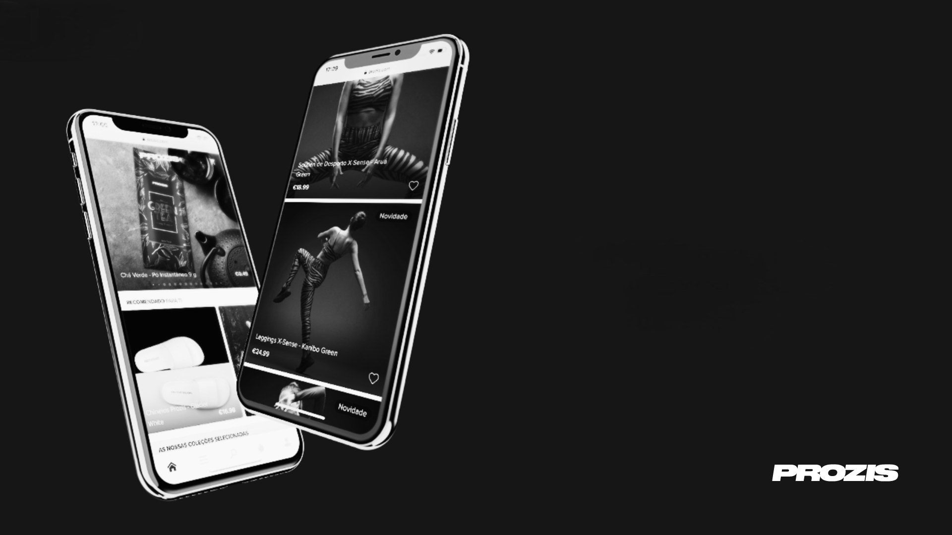
ProzisDesign Leadership, Product Design, Design Systems

The Scene ClubAndroid App
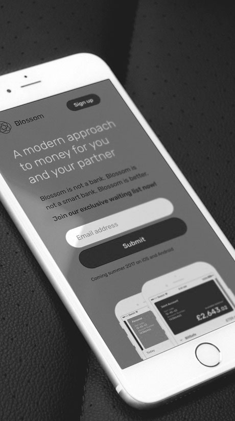
BlossomMobile App & Landing Page

Betfair ExchangeWeb App
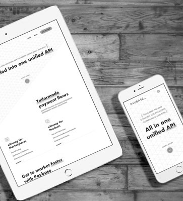
PaybaseWebsite & Branding

EY MobilityWeb App
Made with ❤️ by Sónia Gomes @2024
Made with ❤️ by Sónia Gomes @2024
Get in touch! 

