This dashboard prototype was built with Ernst & Young to provide a better way to organise all the logistics associated with mobility working schemes.
This dashboard prototype was built with Ernst & Young to provide a better way to organise all the logistics associated with mobility working schemes.
COMPANY
COMPANY
Tigerspike
Tigerspike
ROLE
ROLE
Senior UI/UX Designer
Senior UI/UX Designer
SKILLS
SKILLS
Design Thinking, Co-creation, Information Architecture, User Experience, Wireframes, Prototyping, User Interface, Stakeholder Management
Information Architecture, Co-creation, UX/UI, Design Thinking
THE PROBLEM
THE PROBLEM
Many of Ernst & Young’s partners provide consultancy services to companies around the globe. They often assign employees to countries abroad for extended periods of time and have mobility departments to deal with all the associated logistics.
It was found that many assignees have frustrations arising from a lack of visibility and operations on activities such as tax returns, information requests, compliance timelines and others.
One of the main problems is the required use of many different and disconnected tools to manage mobility experience. This problem affects both assignees and mobility managers and leads to unorganised management and unnecessary costs.

DISCOVERY & CO-CREATION
DISCOVERY & CO-CREATION
The project began with a series of ideation and co-creation workshops, that included all of the project participants: product owners, business analysts, designers, developers, key stakeholders and business partners.
Many of these workshops occurred with remote participants, usually key stakeholders and business partners, using tools like Mural to facilitate cooperation and co-working.
To aid the co-creation sessions, personas were created to reflect the different product users characteristics.
The project began with a series of ideation and co-creation workshops, that included all of the project participants: product owners, business analysts, designers, developers, QAs and actual customers.
Many of these workshops occurred with remote participants, using tools like Mural to facilitate cooperation and co-working.
To aid the co-creation sessions, personas were created to reflect the different product users characteristics.
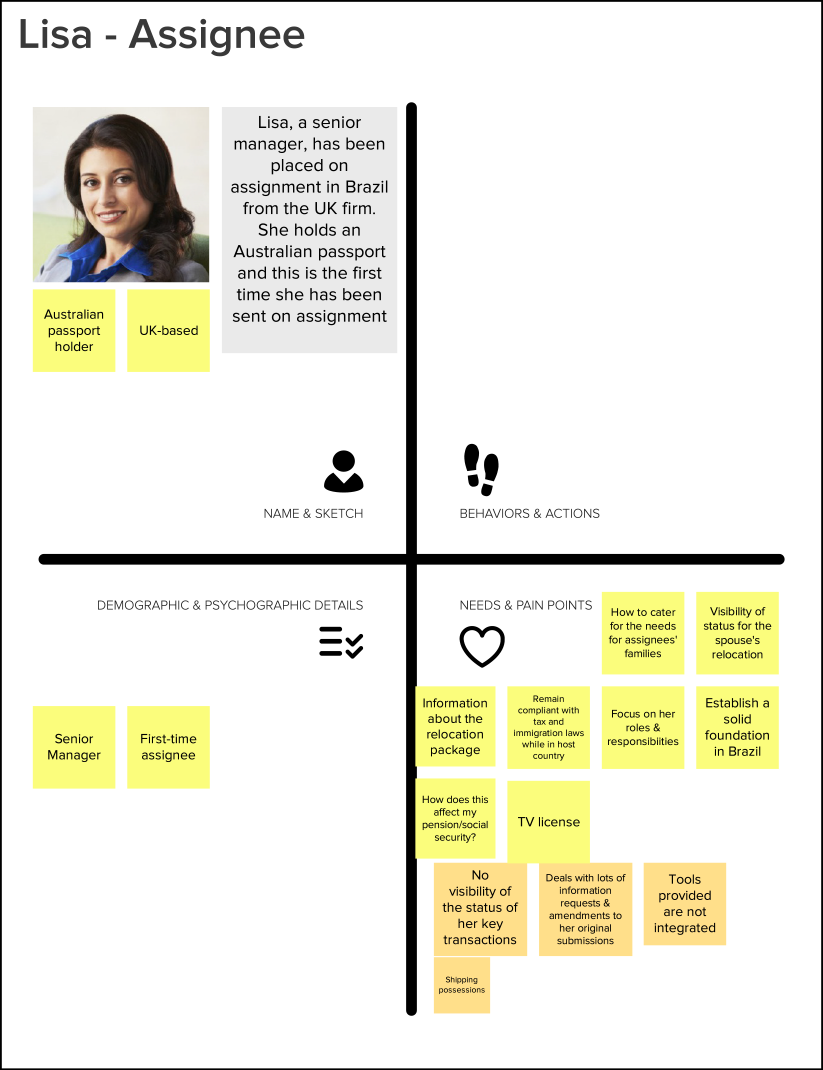
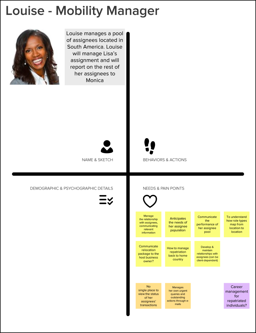
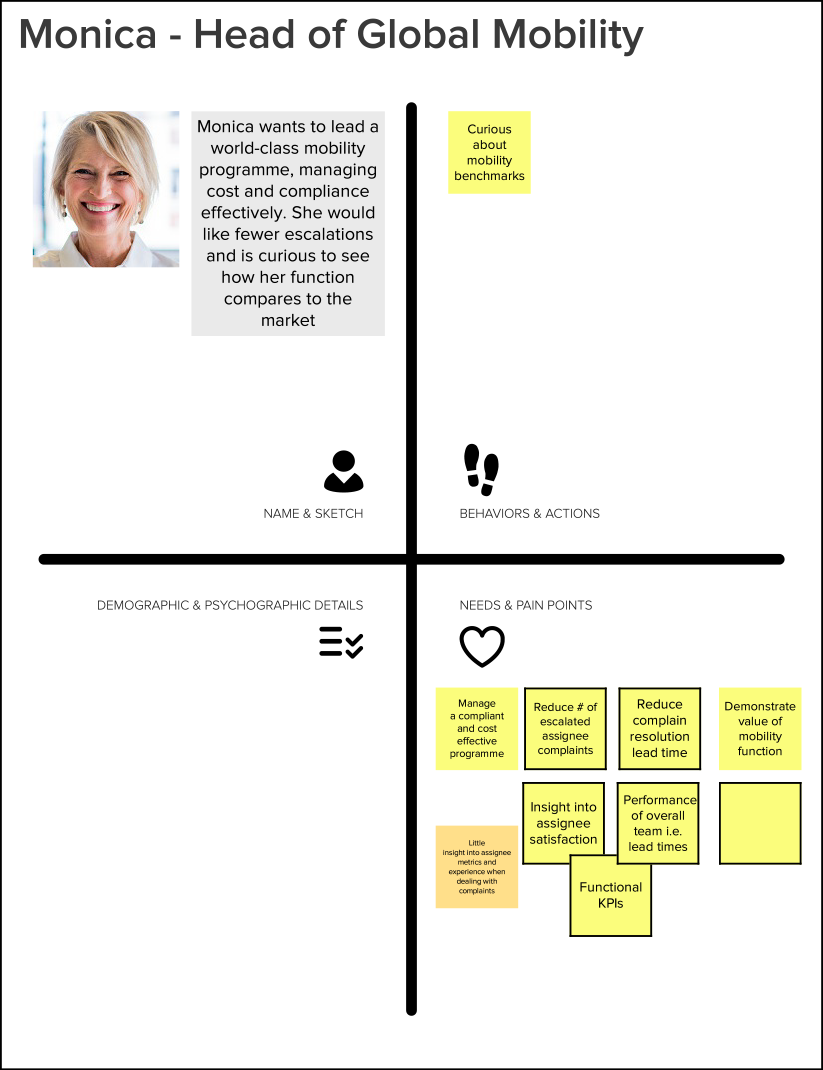
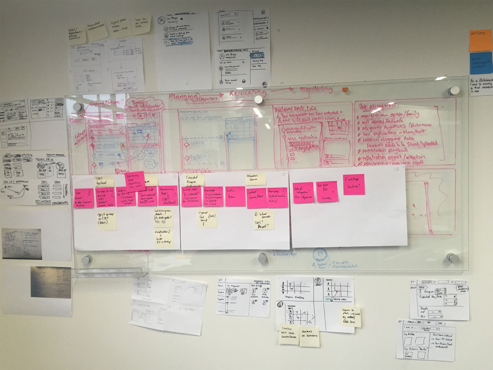
Several techniques like paper prototyping and collaborative sketching were used as ways of communicating design ideas. Other workshops involved discussion of raw ideas using post-its and refinement methods like the Five Whys.
Several techniques like paper prototyping and collaborative sketching were used as ways of communicating design ideas. Other workshops involved discussion of raw ideas using post-its and refinement methods like the Five Whys.
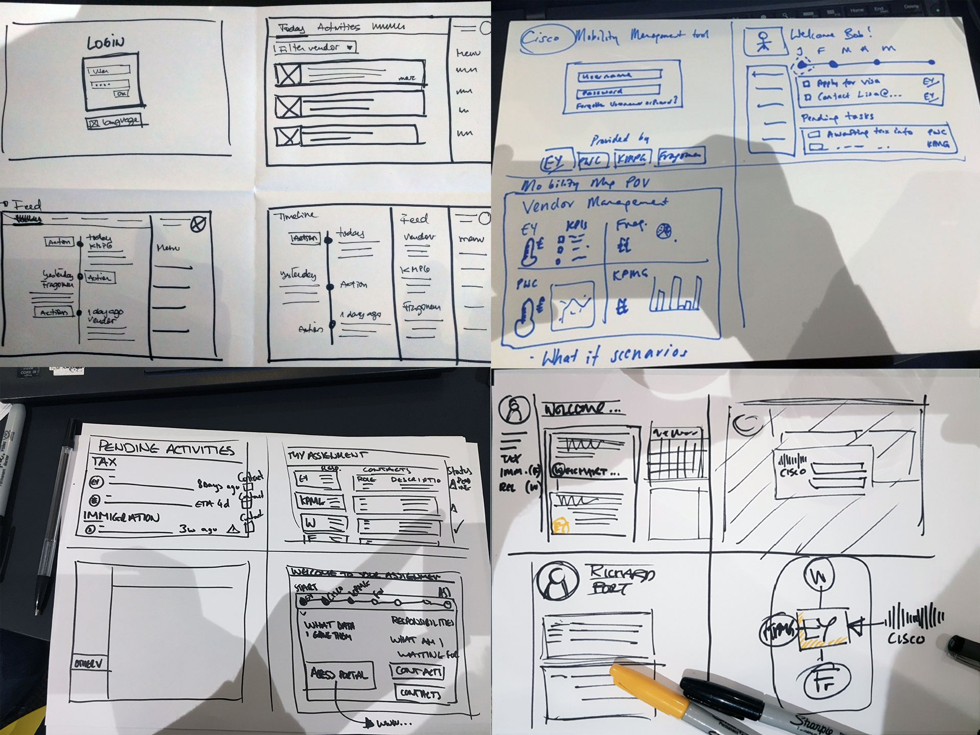
OUTPUTS OF COLLABORATIVE SKETCHING
WORKSHOP ANALYSIS
STORYBOARD
USER JOURNEYS
The following storyboard depicts the full journey that the user can take when using the dashboard. It includes all permutations for the different types of users: the head of mobility, the mobility manager and the employee. It also illustrates which separate systems were used for each operation, and how we would unify them.
According to the different types of users, the head of mobility, the mobility manager and the assignee, several user journeys were defined.
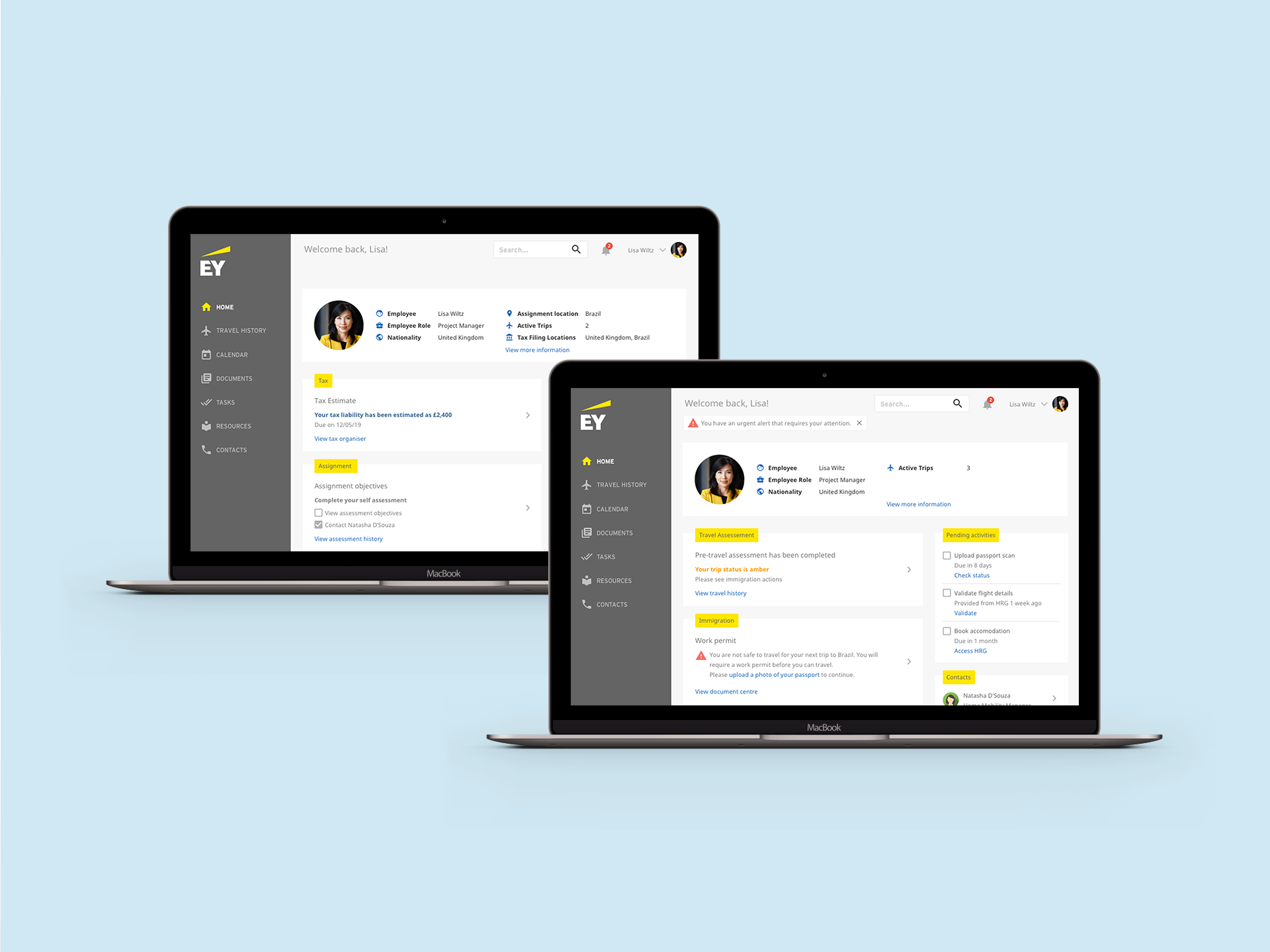
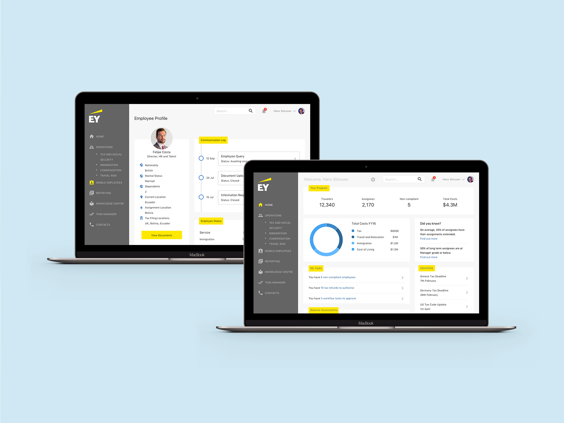
For example, the mobility manager would have a place with stats and data about his/her assignees, as well as tasks to complete and other information. On the other hand, an assignee would have a dedicated view with his/her tasks, travel and journey information and other relevant data.
OUTCOMES
OUTCOMES
After the discovery and co-creation phase, a cross-functional team, composed of business analysts, product owner, scrum master, designers, developers and QAs was assembled. This team worked on 1-week iterations to produce the defined user journeys. The team started producing interactive inVision prototypes but early started developing working HTML, CSS & JS prototypes. At the end of each iteration, the produced piece was showcased to stakeholders and potential customers, and feedback was collected.
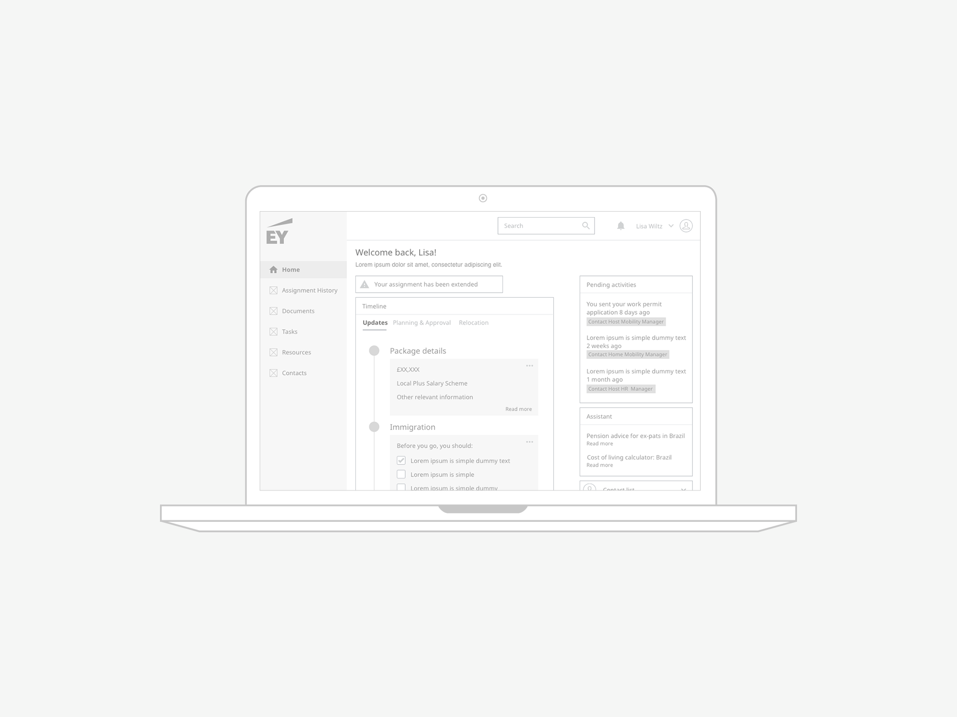
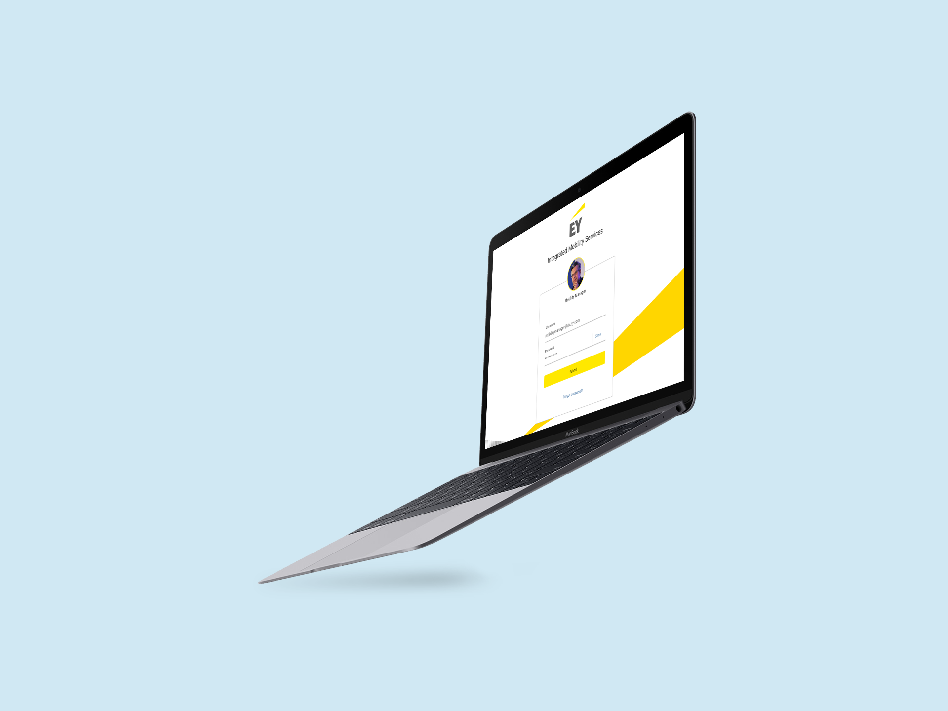
Below are the outputs of these iterations, including wireframes and final designs for multiple experiences. The mobility manager would have a place with stats and data about his/her assignees, as well as tasks to complete and other information. On the other hand, an assignee would have a dedicated view with his/her tasks, travel and journey information and other relevant data.
After the discovery and co-creation phase, a cross-functional team, composed of business analysts, product owner, scrum master, designers, developers and QAs was assembled. This team worked on 1-week iterations to produce the defined user journeys. The team started producing interactive inVision prototypes but early started developing working HTML, CSS & JS prototypes. At the end of each iteration, the produced piece was showcased to stakeholders and potential customers, and feedback was collected.
Below are the outputs of these iterations, including wireframes and final designs
SELECTED WORKS

UpholdProduct Design
OutsystemsDesign Leadership, Design Operations, Design Systems & Research Ops
ProzisDesign Leadership, Product Design, Design Systems
The Scene ClubAndroid App
BlossomMobile App & Landing Page

Betfair ExchangeWeb App
PaybaseWebsite & Branding

EY MobilityWeb App
Made with ❤️ by Sónia Gomes @2024
Made with ❤️ by Sónia Gomes @2024
Get in touch! 


