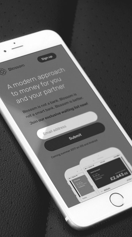
The Blossom project was a lean experiment performed to gather user feedback and measure the demand and interest of consumers on a particular kind of banking app.
The Blossom project was a lean experiment performed to gather user feedback and measure the demand and interest of consumers on a particular kind of banking app.
COMPANY
COMPANY
Paybase
Paybase
ROLE
ROLE
Design Lead
Design Lead
SKILLS
SKILLS
User Interface, User Experience, Responsive Design, Product Design
User Interface, User Experience, Responsive, Mobile Design, Product Design
BUSINESS CHALLENGE
BUSINESS CHALLENGE
Whilst Paybase decided to pivot from a mobile app to a payment's solution SAAS, there was an interest in trying one more approach on the mobile app market. The previous app, Payfriendz, did not have the expected success and traction, so this time the company opted a more lean approach. The new app concept was a virtual bank aimed at joint accounts, with the goal of helping couples managing their finances. Instead of diving directly into the development of this new idea, an experiment was created to measure its possible traction.
Whilst Paybase decided to pivot from a mobile app to a payment's solution SAAS, there was an interest in trying one more approach on the mobile app market. The previous app, Payfriendz, did not have the expected success and traction, so this time the company opted a more lean approach. The new app concept was a virtual bank aimed at joint accounts, with the goal of helping couples managing their finances. Instead of diving directly into the development of this new idea, an experiment was created to measure its possible traction.
THE APP PROTOYPE
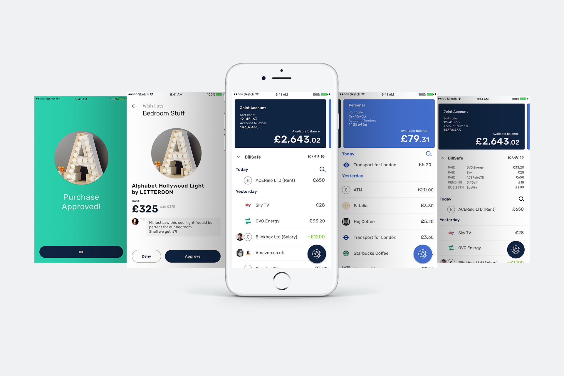
A complete set of UI designs had to be produced to showcase the various app features. These designs included bank account information, an illustrated list of transactions, wish lists with a joint purchase decision system and more.
The BillSafe feature was also a potencial attractive proposition because it could allow the user of save some money by rounding up transactions and saving the excess.
The app was focused on educating couples on financial wellbeing, and allowing them to manage money in a smart and hassle-free way. Communication and transparency were the core values that motivated the creation of Blossom. We wanted to create an app not only to solve couples' financial problems but also to prevent them.
THE WEBSITE
THE WEBSITE
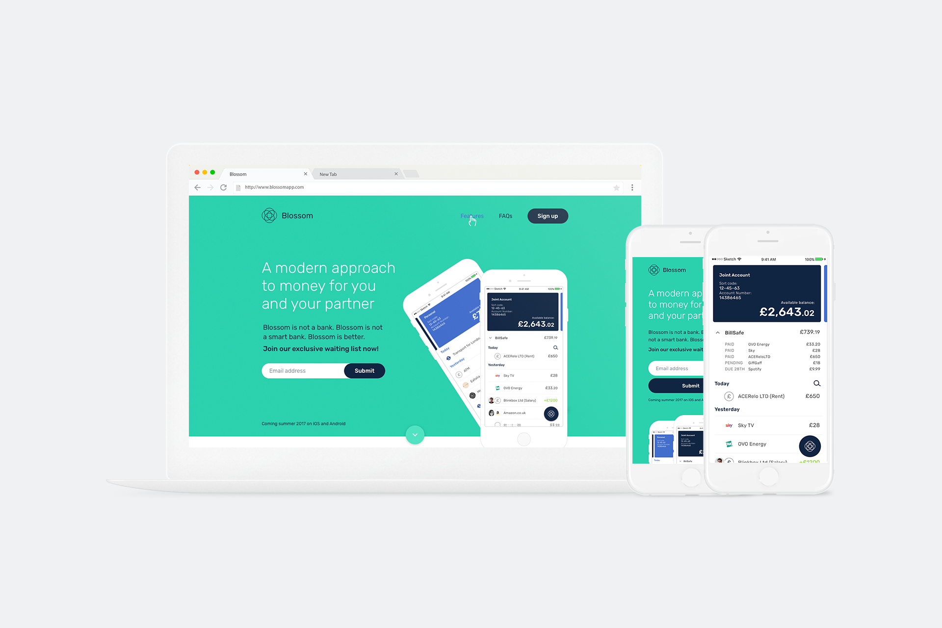
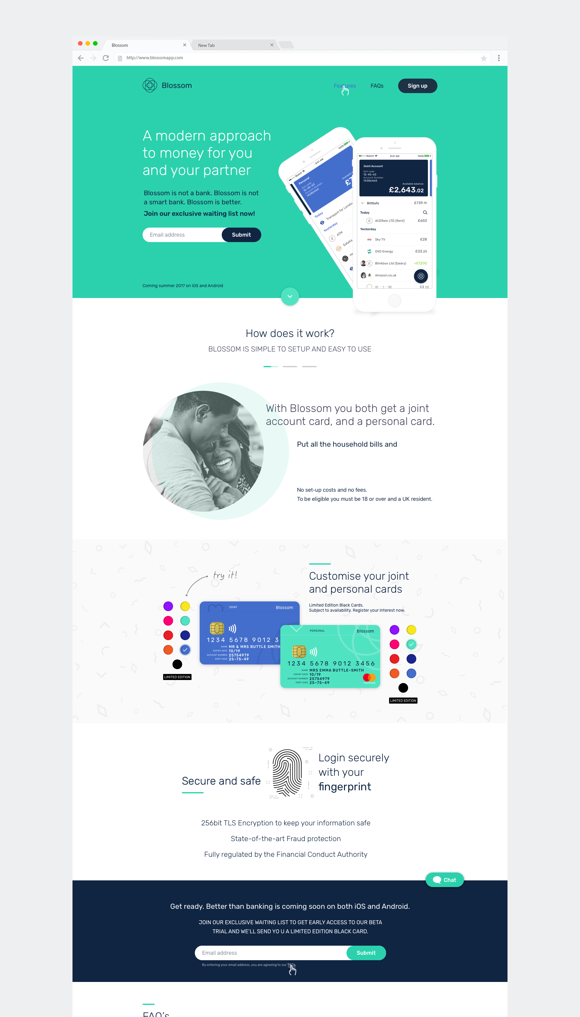
In order to get the necessary feedback from potential users, without the effort and cost of developing a fully functioning app, the business decided to create a smoke page. This smoke page would showcase the envisioned product with its features, and contain several CTAs where the visitor would input its email if he or she were to be interested. The placement of the CTAs on both the hero and the top left menu provided a clear path for sign ups.
In order to get the necessary feedback from potential users, without the effort and cost of developing a fully functioning app, the company decided to create a smoke page. This smoke page would showcase the envisioned product with its features, and contain several CTAs where the visitor would input its email if he or she were to be interested. The placement of the CTAs on both the hero and the top left menu provided a clear path for sign ups.
A complete set of UI designs had to be produced to showcase the various features. These designs included bank account information, an illustrated list of transactions, wish lists with a joint purchase decision system and more.
One of the characteristics the company thought that would attract potential users was the ability to customise their cards. An interactive and visually appealing interface was designed to demonstrate this feature.
How were we measuring sucess? In order to consider the experiment successful, we set a target of 5000 sign-ups. Other metrics such as bounce rate, visitor flow and conversion rate were also tracked. The app and website were also massively advertised in social media.
MOBILE
MOBILE
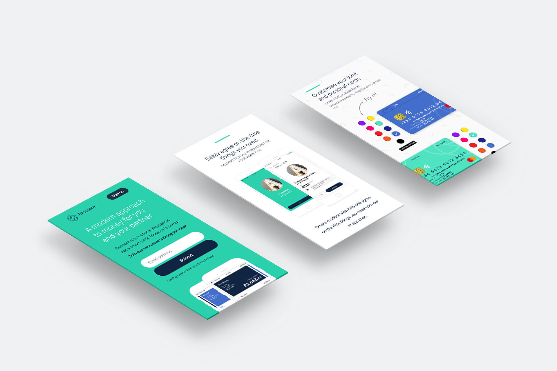
In order to target a young audience, between 20-35 years old and heavy social media users, this smoke page was designed in a responsive way, with the use of a grid to streamline its implementation. Below are the various adaptations to a smaller viewport.
In order to target a wider audience, this smoke page was designed in a responsive way, with the use of a grid to streamline its implementation. On the left are the various adaptations to a smaller viewport.
SELECTED WORKS

UpholdProduct Design
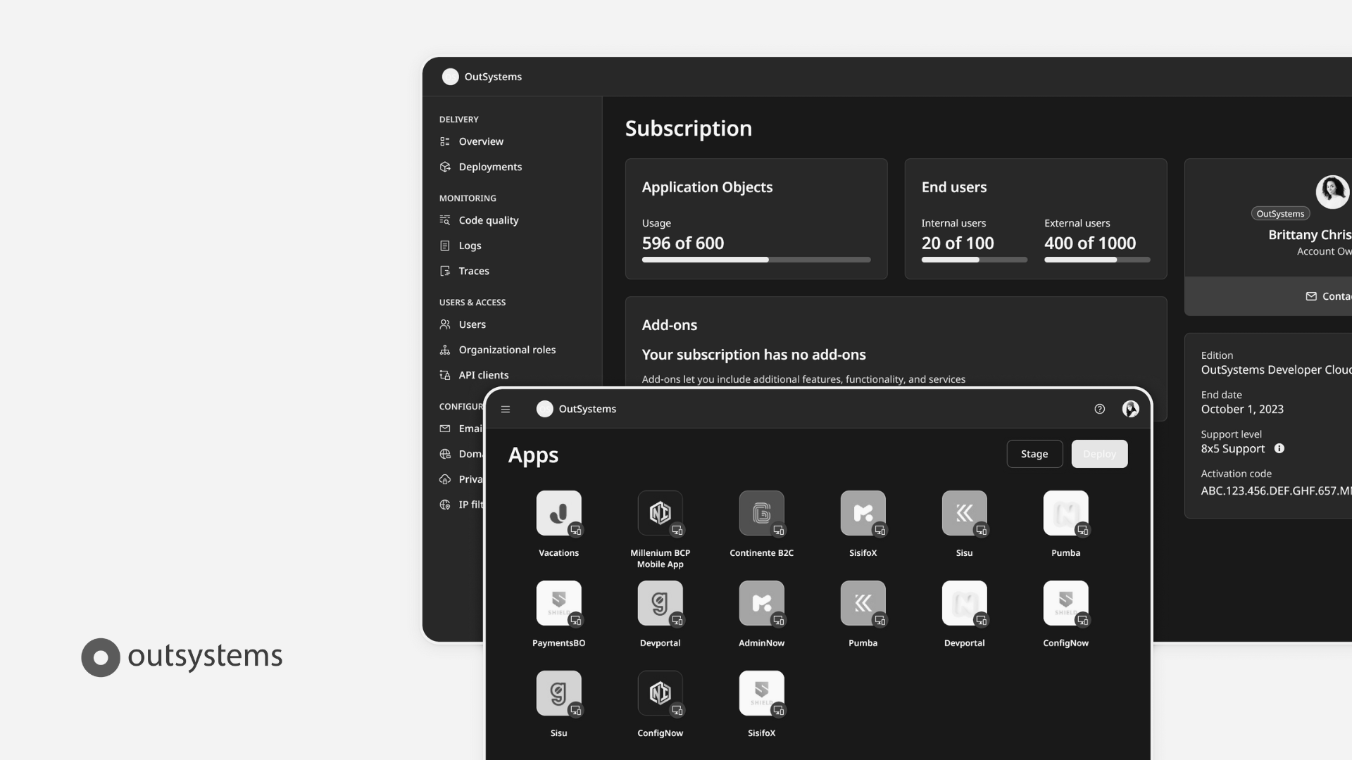
OutsystemsDesign Leadership, Design Operations, Design Systems & Research Ops
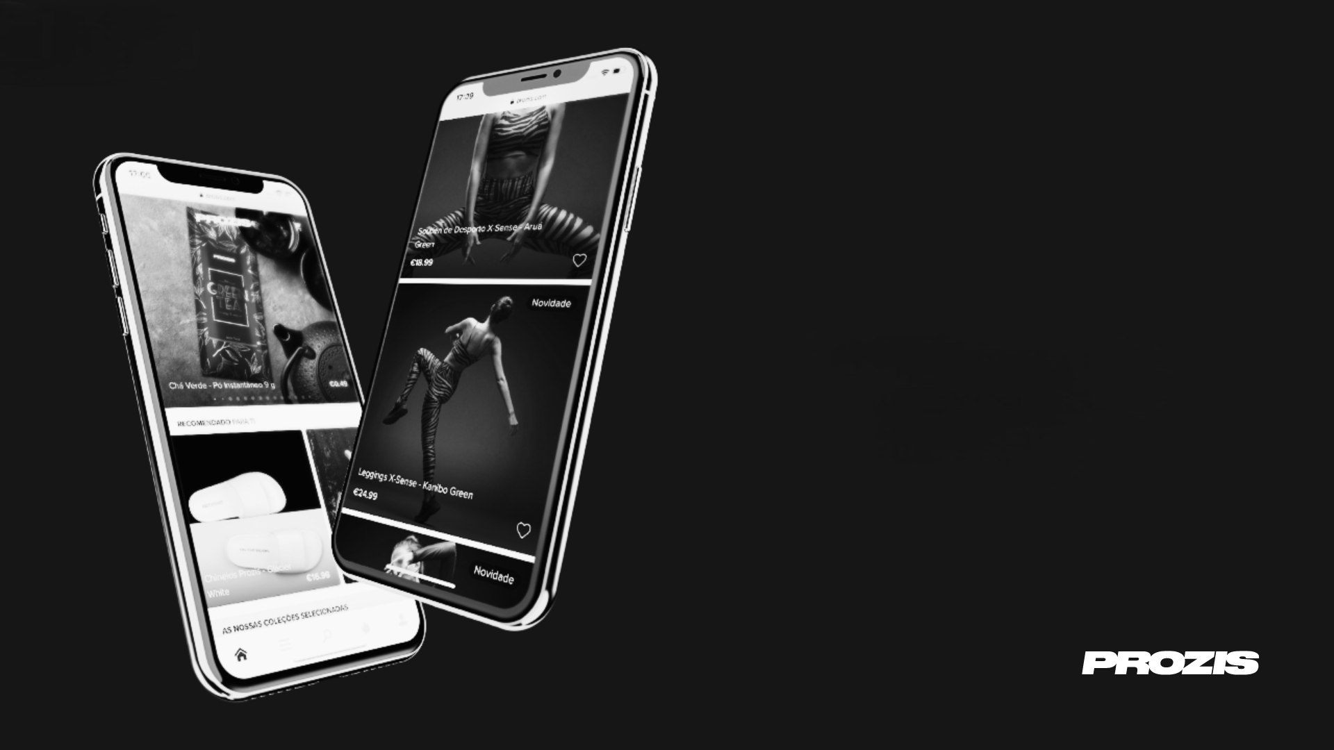
ProzisDesign Leadership, Product Design, Design Systems

The Scene ClubAndroid App
BlossomMobile App & Landing Page

Betfair ExchangeWeb App
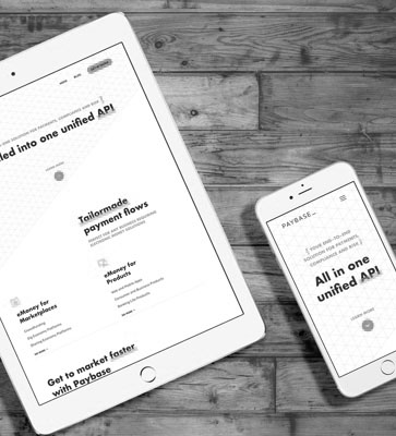
PaybaseWebsite & Branding

EY MobilityWeb App
Made with ❤️ by Sónia Gomes @2024
Made with ❤️ by Sónia Gomes @2024
Get in touch!  +351 917 373 380
  hello@soniagomes.me