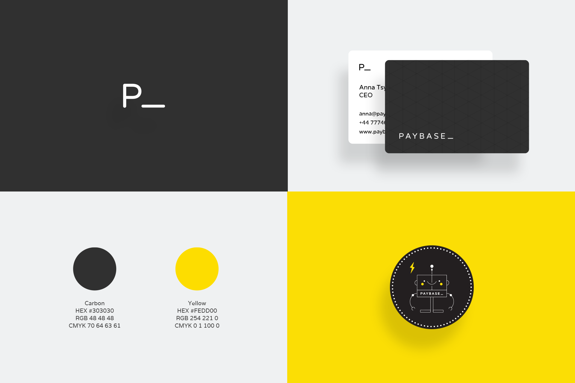
My first challenge at Paybase was a complete rebranding. This meant not only creating the visual language, but also their website, presentation deck templates and other visual artifacts.
My first challenge at Paybase was a complete rebranding. This meant not only creating the visual language, but also their website, presentation deck templates and other visual artifacts.
COMPANY
COMPANY
Paybase
Paybase
ROLE
ROLE
Design Lead
Design Lead
SKILLS
SKILLS
Branding, Graphic Design, User Interface, User Experience, Responsive Design
User Interface, User Experience, Responsive, Branding
BUSINESS CHALLENGE
BUSINESS CHALLENGE
Like any brand, a company brand needs to differentiate itself, resonate with customers, inspire employees and most importantly reflect the company's vision. Paybase had just decided to pivot its main product from a mobile app targeted at customers (Payfriendz) to a B2B payments platform solution targetted to companies that wanted to develop payments and marketplaces applications. This presented an interesting challenge, the product and brand no longer needed to appeal to the consumer but to tech companies and their developers.
Like any brand, a company brand needs to differentiate itself, resonate with customers, inspire employees and most importantly reflect the company's vision. Paybase had just decided to pivot its main product from a mobile app targeted at customers (Payfriendz) to a B2B payments platform solution targetted to companies that wanted to develop payments and marketplaces applications. This presented an interesting challenge, the product and brand no longer needed to appeal to the consumer but to tech companies and their developers.
THE WEBSITE
THE WEBSITE
The website needed to contain a diverse range of information, showcase the product and above all convert visitors into potential customers. Below are the most relevant and challenging sections.
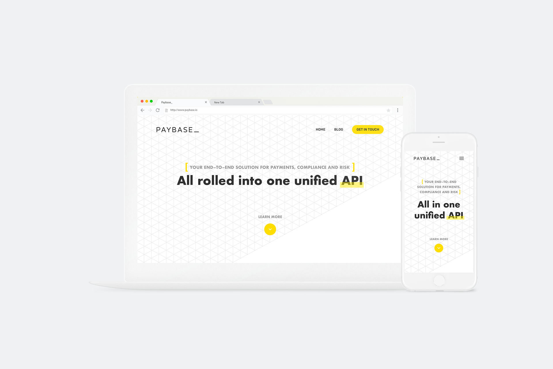
The first screen shows the website's hero. This is a very important section as it is the first thing visitor's see and therefore the first opportunity to convert them.
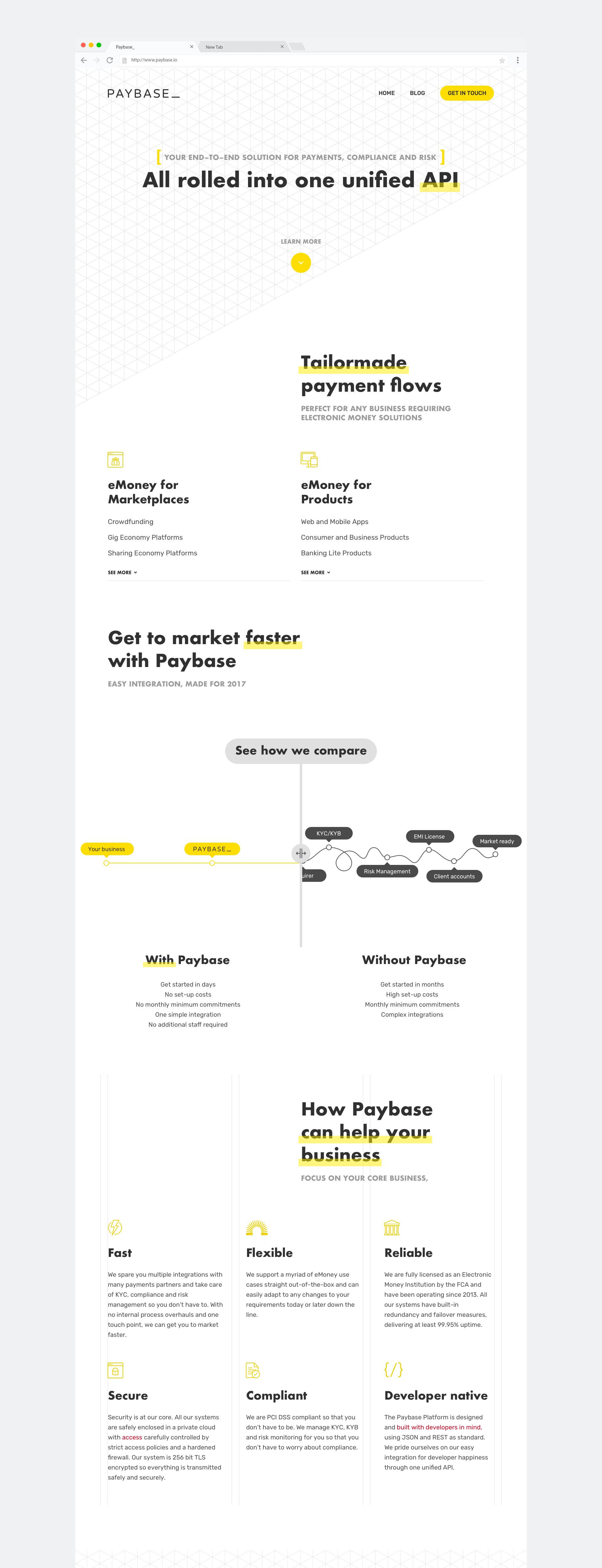
One of the most challenging parts was to explain the product features in a simple and appealing way but also detailed enough for the target audience. Being a back-end platform that handles financial operations, this product was very complex in its nature.
After some experiments, diagrams were considered the best way to tackle this challenge. The involvement of various parties, from the CEO to developers, customer support and marketing, was essential to build these diagrams.
Another interesting and fun section to design was the comparison slider. There was a need to explain how Paybase streamlined and simplified a payment's solution.
An interactive slider was the best way to represent this. With the solution with the platform on one end, and without at the other end, the user can interact and see in an engaging way how the product simplifies and provides value.
THE CONSOLE
THE CONSOLE
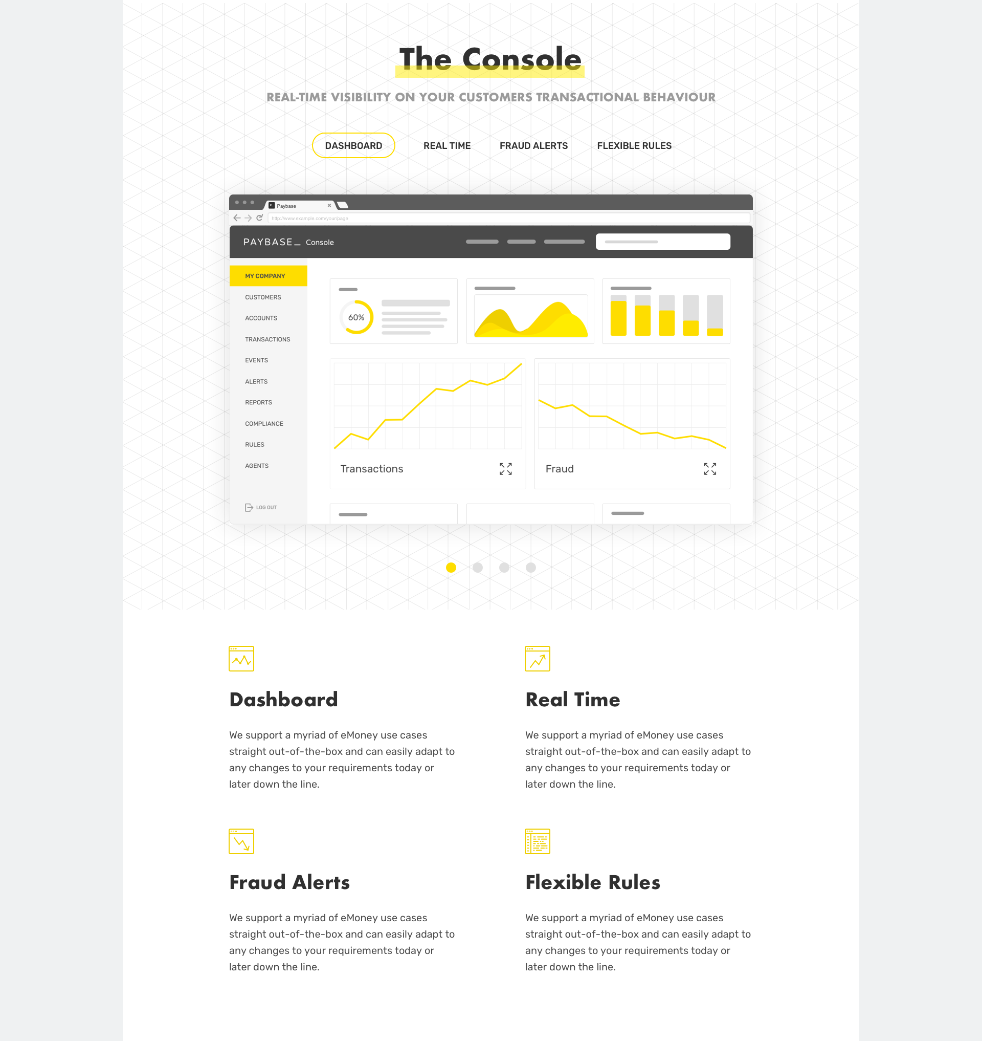
The company also wanted to showcase a part of the product that was not developed already, the admin console. In order to do this, some wireframes and mockups ended up being designed and placed on the website.
The company also wanted to showcase a part of the product that was not developed already, the admin console.
In order to do this, some wireframes and mockups ended up being designed and placed on the website.
MOBILE
MOBILE
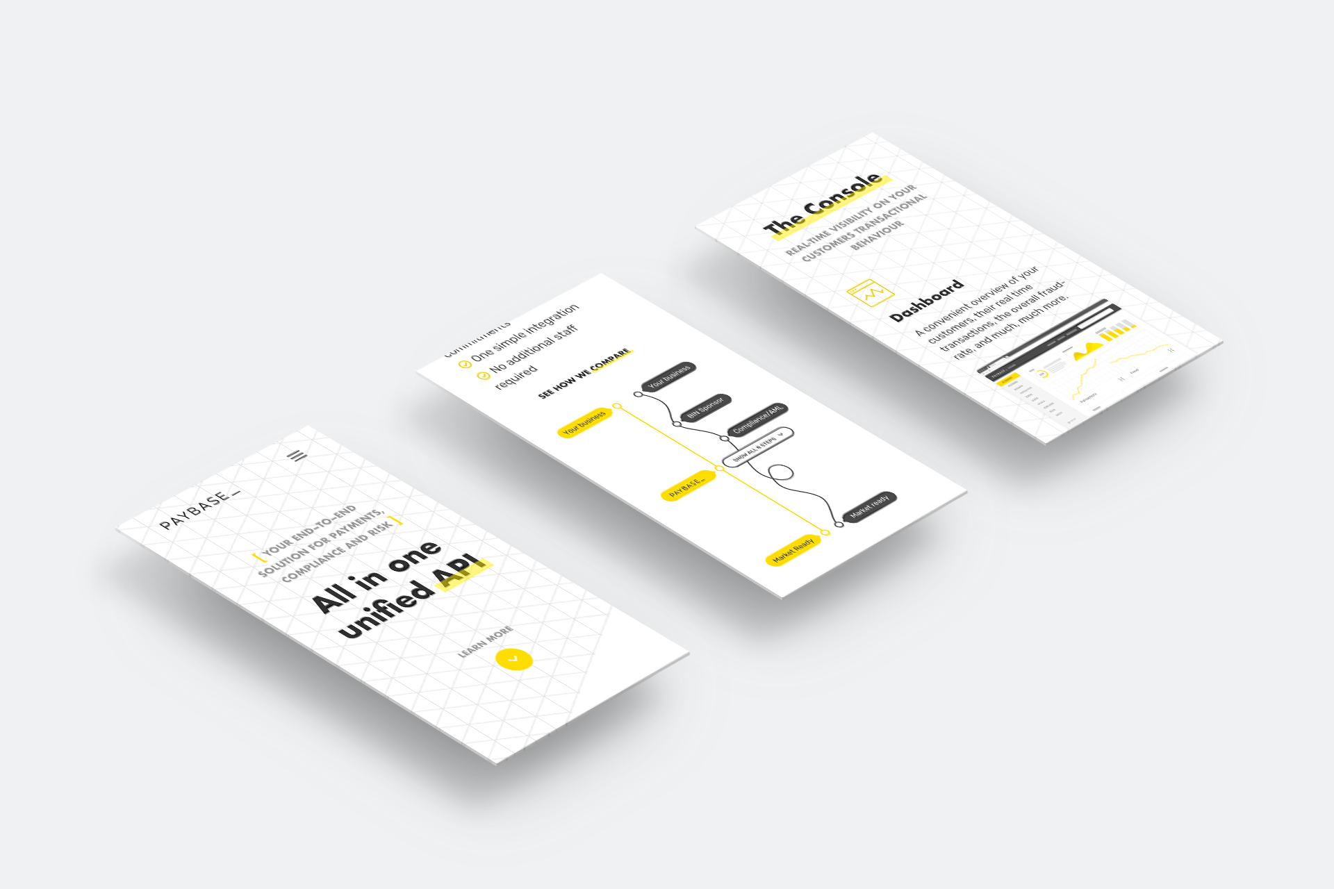
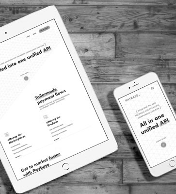
In today's world, no website can go live without a mobile or responsive version. This website was designed in a responsive way, using a grid to streamline its implementation. Below are some examples of how the website reacts in smaller screens.
In today's world, no website can go live without a mobile or responsive version. This website was designed in a responsive way, using a grid to streamline its implementation. Below are some examples of how the website reacts in smaller screens.
SELECTED WORKS

UpholdProduct Design
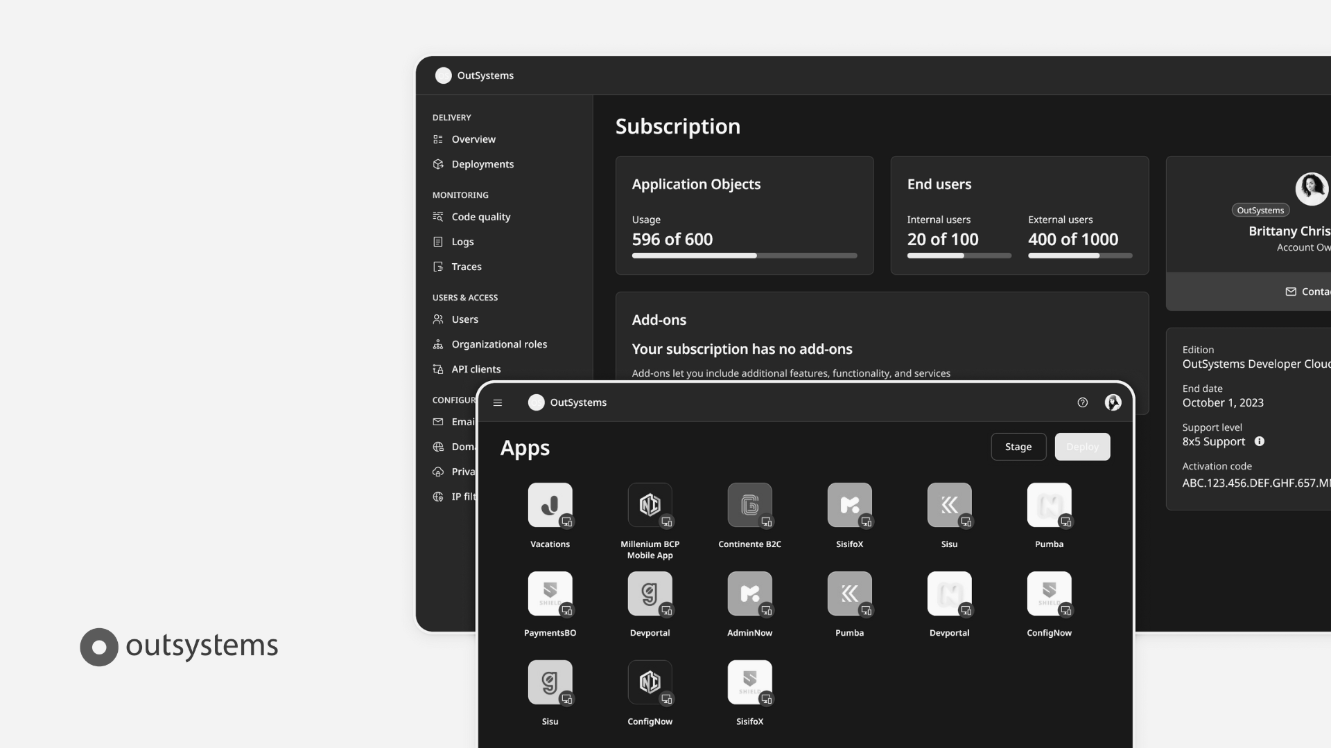
OutsystemsDesign Leadership, Design Operations, Design Systems & Research Ops
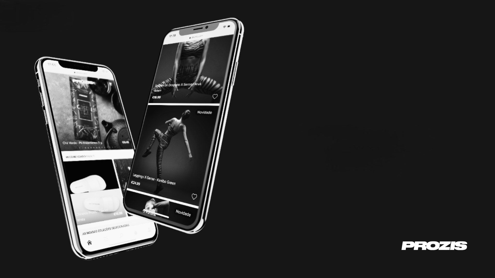
ProzisDesign Leadership, Product Design, Design Systems

The Scene ClubAndroid App
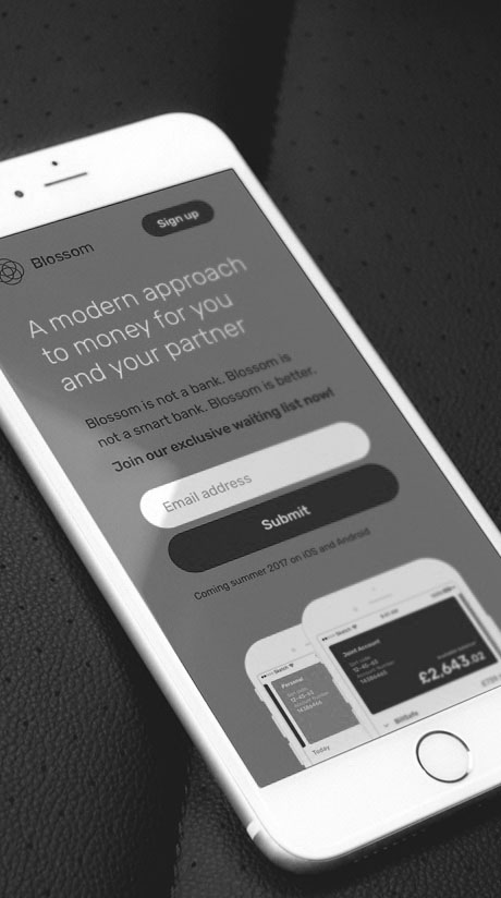
BlossomMobile App & Landing Page

Betfair ExchangeWeb App
PaybaseWebsite & Branding

EY MobilityWeb App
Made with ❤️ by Sónia Gomes @2024
Made with ❤️ by Sónia Gomes @2024
Get in touch! 

