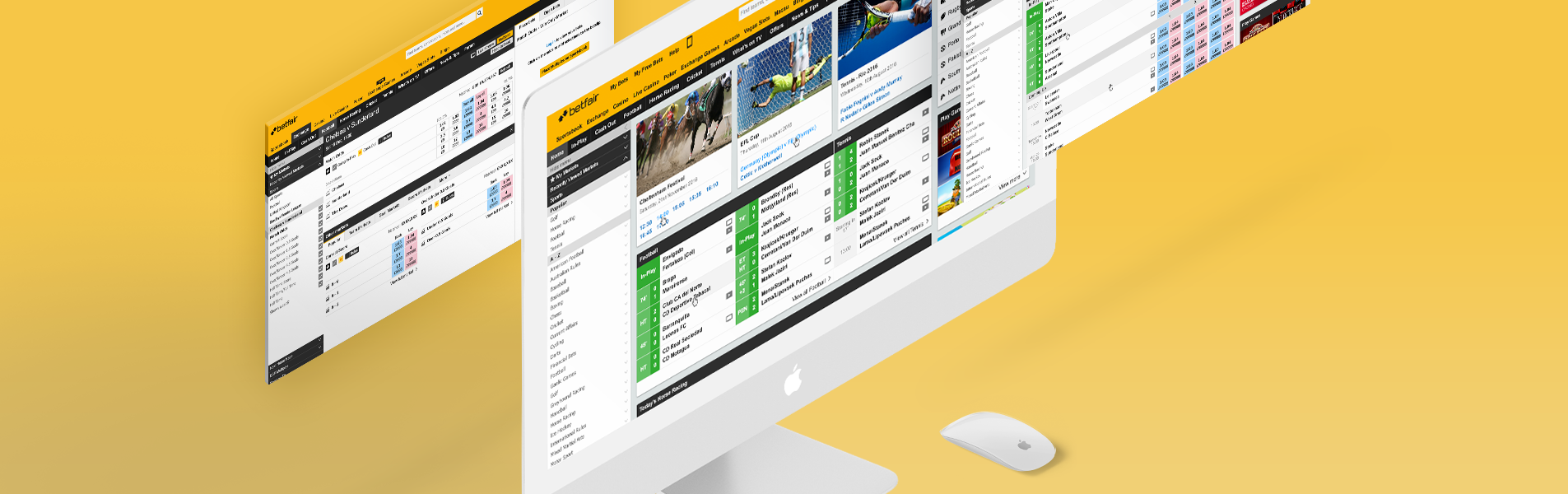
The Exchange is Betfair's flagship product. A big disruptor in the betting business, it introduced the concept of bet trading to the world.
The Exchange is Betfair's flagship product. A big disruptor in the betting business, it introduced the concept of bet trading to the world.
COMPANY
COMPANY
Betfair
Betfair
ROLE
ROLE
Senior UI Designer
Senior UI Designer
SKILLS
SKILLS
User Interface, Atomic Design, Large Scale Design, Styleguide, Agile
Product Design, UX/UI, Atomic Design, Large Scale Design, Agile
BUSINESS CHALLENGE
BUSINESS CHALLENGE
Despite being a well-established product, the Exchange as an experience was in need of some love. The thinking behind this project was redesigning a complex data interface to be usable, functional and appeal to the traders and gamblers. This last requirement was especially sensitive, as professional traders were the main audience and revenue source of the product, and had shown to be quite resistant to change. The great amount of data and controls that formed part of the interface also constituted a big challenge for a modern revamp.
Despite being a well-established product, the Exchange as an experience was in need of some love.
The thinking behind this project was redesigning a complex data interface to be usable, functional and appeal to the traders and gamblers. This last requirement was especially sensitive, as professional traders were the main audience and revenue source of the product, and had shown to be quite resistant to change.
The great amount of data and controls that formed part of the interface also constituted a big challenge for a modern revamp.
WAYS OF WORKING
WAYS OF WORKING
The design team was composed of two separate UI and UX teams. These teams worked remotely, the UX team in the UK and the UI in Portugal. My role in the UI team was of design lead, and as a team lead I also focused my attention on our ways of working, and how we could work better as a team, and in coordination with the remote UX team. We worked in two week sprints with planning, backlog refinements and retrospectives.
The design team was composed of two separate UI and UX teams. These teams worked remotely, the UX team in the UK and the UI in Portugal. My role in the UI team was of design lead, and as a team lead I also focused my attention on our ways of working, and how we could work better as a team, and in coordination with the remote UX team. We worked in two week sprints with planning, backlog refinements and retrospectives.
We constantly worked with the UX team, making prototypes from the ideas and conceptions they gathered from user research. The UX team then led frequent sessions with regular customers as well as VIP customers. We also watched these sessions remotely and took our own conclusions and learnings to later share and discuss with the broad design team. Providing the UI for these prototypes with enhanced detail proved to be very efficient in testing new features, as well as in capturing the users' reactions to visual changes to what they were used to.
In the end of each sprint, the team performed sprint reviews and demos to key stakeholders in order to gather feedback and making sure we were going the same direction as the business.
We constantly worked with the UX team, making prototypes from the ideas and conceptions they gathered from user research. The UX team then led frequent sessions with regular customers as well as VIP customers. We also watched these sessions remotely and took our own conclusions and learnings to later share and discuss with the broad design team.
Providing the UI for these prototypes with enhanced detail proved to be very efficient in testing new features, as well as in capturing the users' reactions to visual changes to what they were used to. In the end of each sprint, the team performed sprint reviews and demos to key stakeholders in order to gather feedback and making sure we were going the same direction as the business.
THE APPROACH
THE APPROACH
The broad design team agreed on taking a modular approach to this challenge. This approach allowed us to conceive and test modules separately as well as iterate on them safely without compromising the rest of the experience.
The modular approach also enabled us to think of ways of personalising the experience according to the user's needs and preferences, like rearranging the modules positions or even displaying and hiding relevant modules according to several factors.
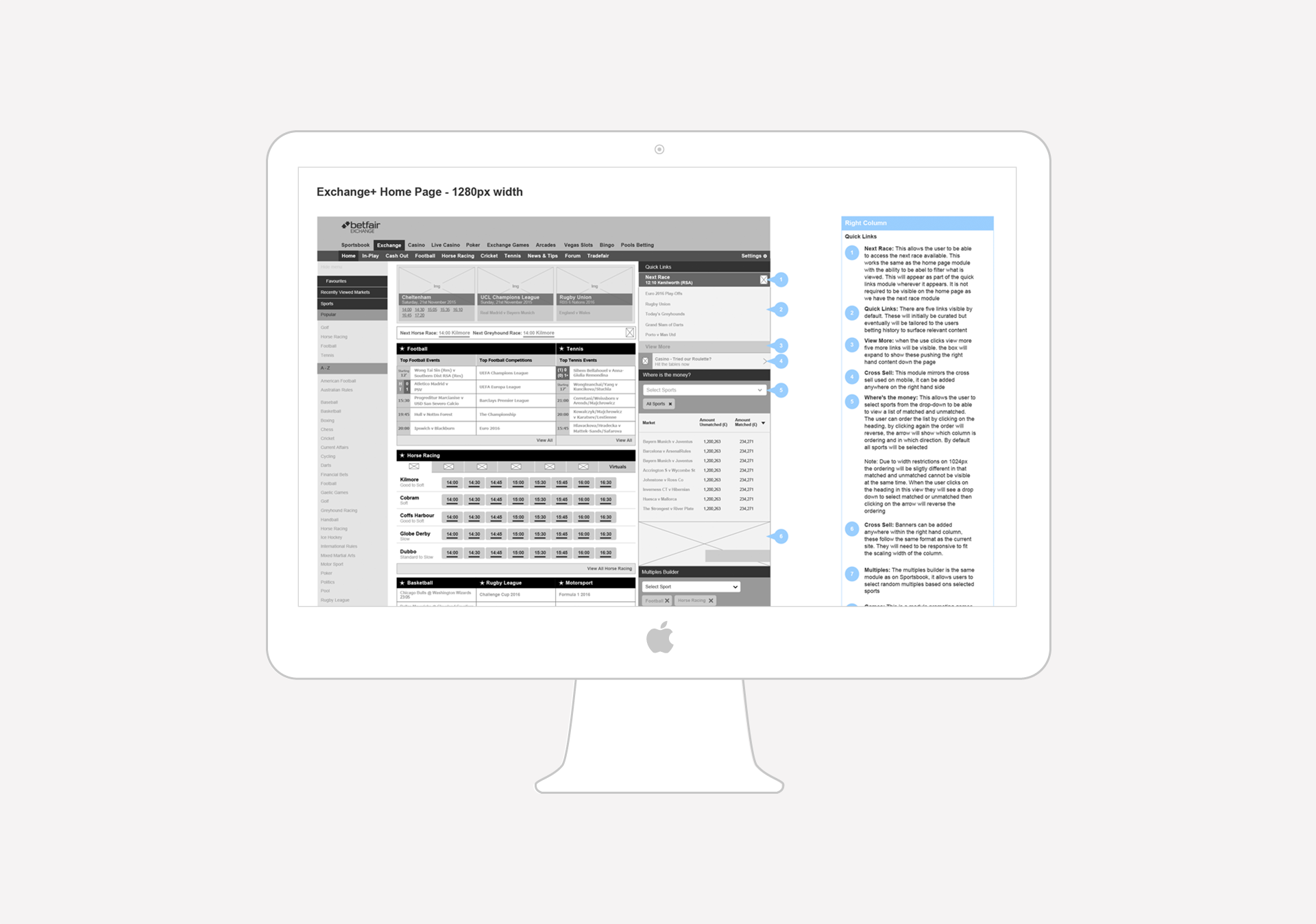
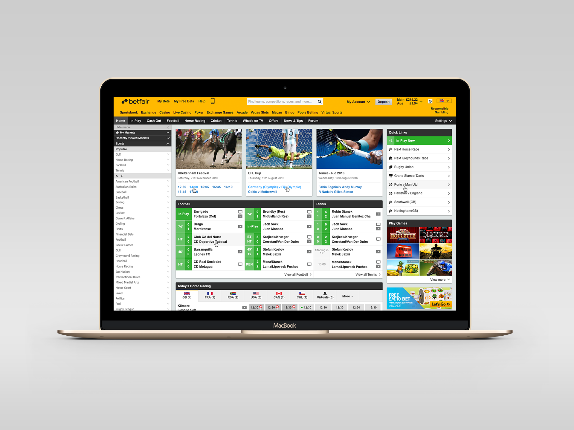
For example, the homepage below is composed of three main sections. The left hand menu is static and is present throughout every journey. On the other hand, the middle and right sections are composed of modules that can be dynamically rearranged according to the time of the year, high profile competitions in certain sports, or even according to the user's patterns.
CARDS AND ATOMS
CARDS AND ATOMS
In order to materialise the modularity of this structure, I decided to use a card based design approach, that gave a modern and clean look to the overall appearance of the product.
There were many challenges when it came to giving life to these wireframes. One of them was the presence of so many modules with so many controls and data within them, which made it very difficult to stand out the most important elements.
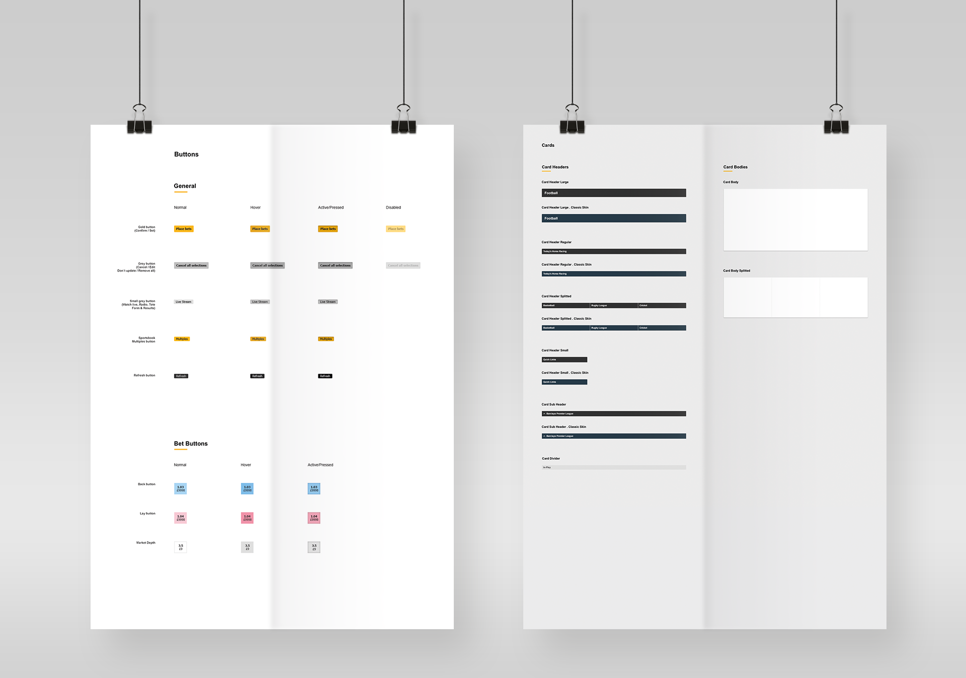
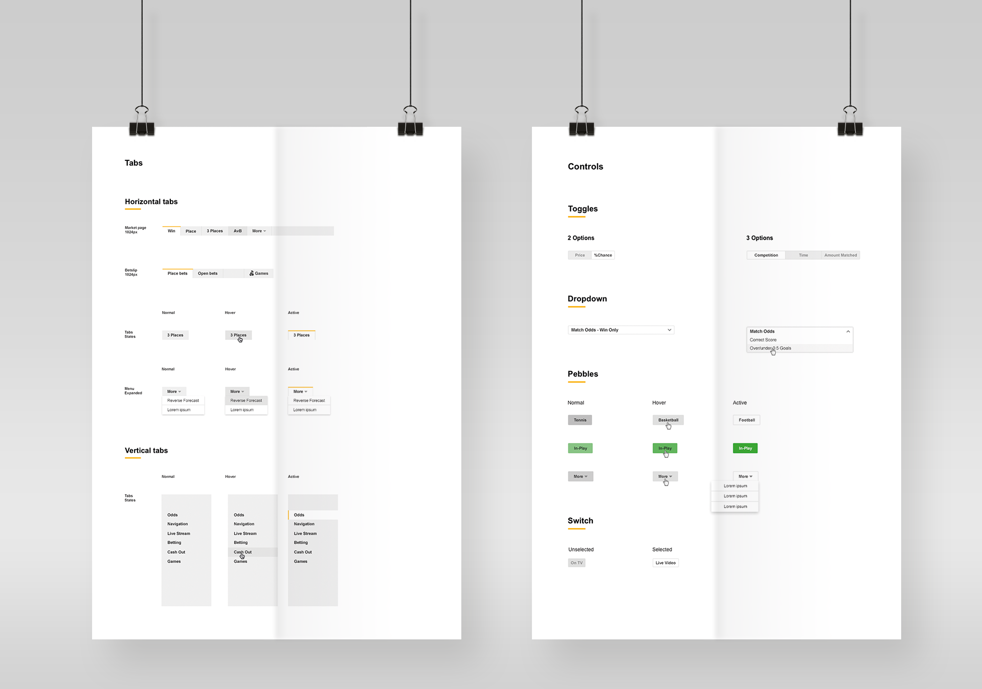
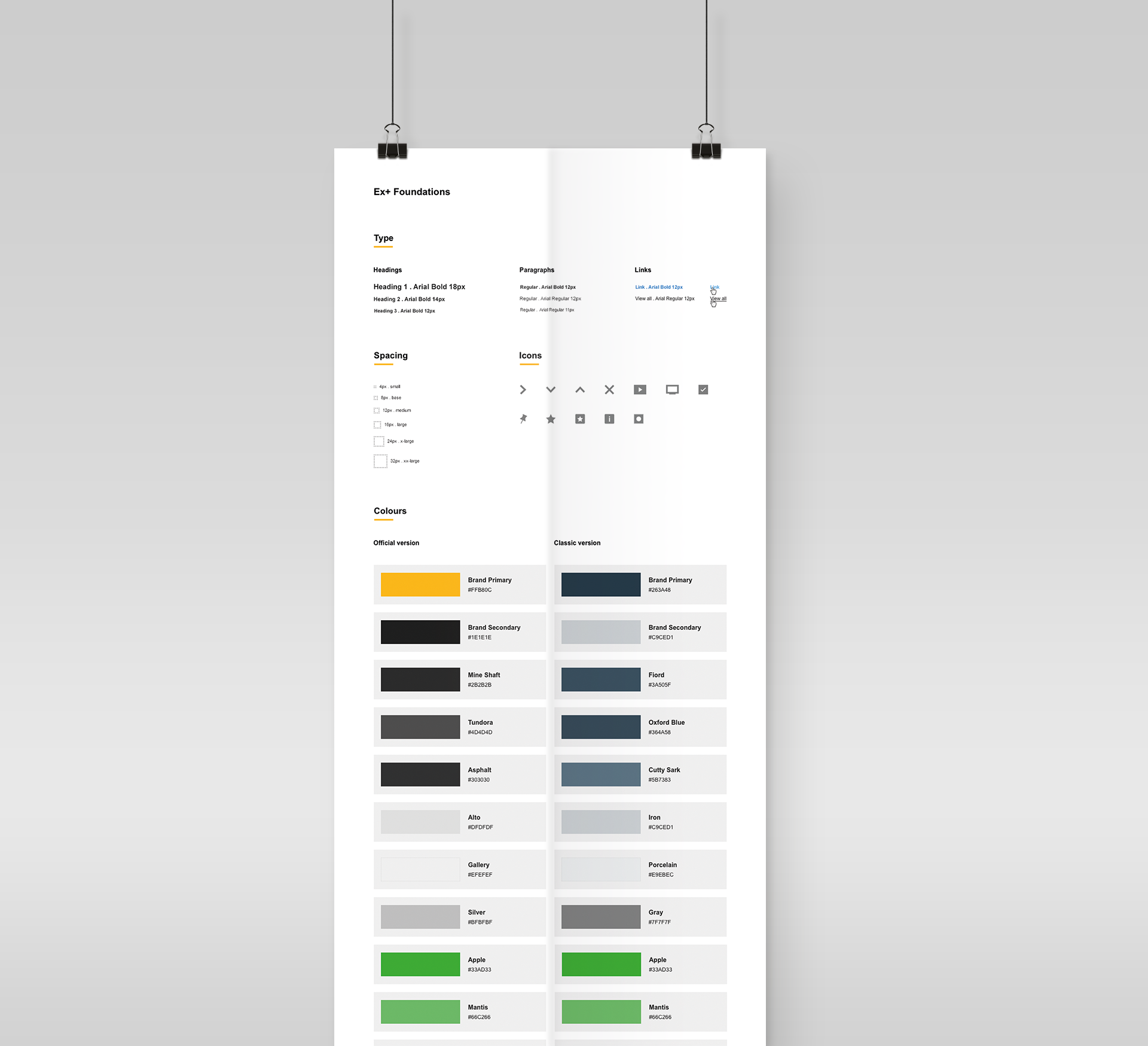
In order to maintain clarity and approach the UI design in a reusable and organised way, I resorted to the use of the Atomic design methodology. Starting with the most basic elements (the atoms) I began defining visual components and organising them in style guides.
These basic elements included all buttons and its states and variations, the different card headers and card bodies, and other controls like tabs, radio buttons, switches, select boxes, etc.
In order to materialise the modularity of this structure, I decided to use a card based design approach, that gave a modern and clean look to the overall appearance of the product.
There were many challenges when it came to giving life to these wireframes. One of them was the presence of so many modules with so many controls and data within them, which made it very difficult to stand out the most important elements.
MOLECULES AND SCOREBOARDS
CARDS AND ATOMS
I then assembled these atoms into what the methodology calls molecules. These molecules are elements that are composed of different atoms. A perfect example of organisms are the different coupons that were created. These coupons consist of card elements containing headers, sub-headers and different arrangements of buttons and icons. These coupons also needed to be organised and classified in a manner that would promote their reusability.
In order to materialise the modularity of this structure, I decided to use a card based design approach, that gave a modern and clean look to the overall appearance of the product.
There were many challenges when it came to giving life to these wireframes. One of them was the presence of so many modules with so many controls and data within them, which made it very difficult to stand out the most important elements.
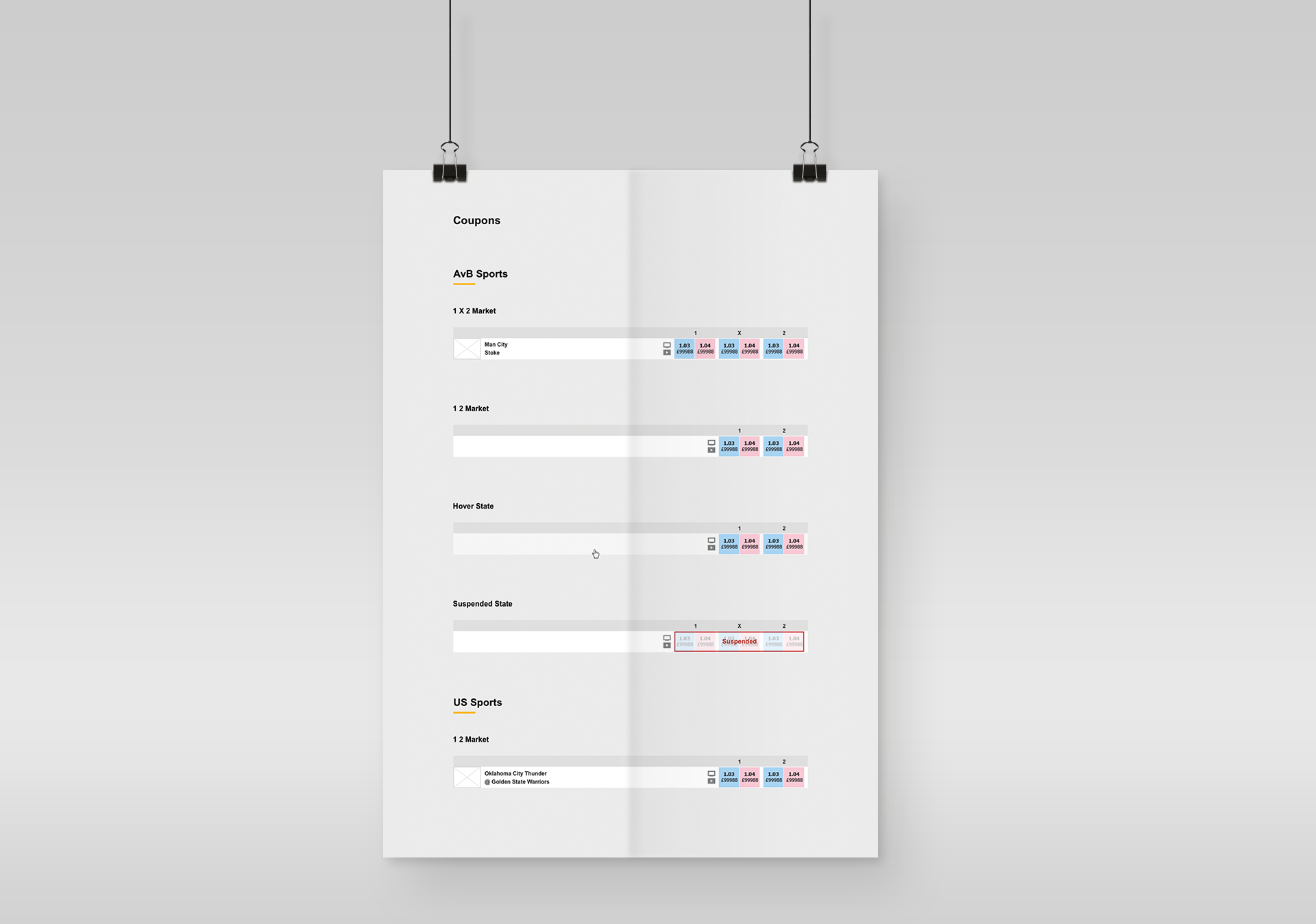
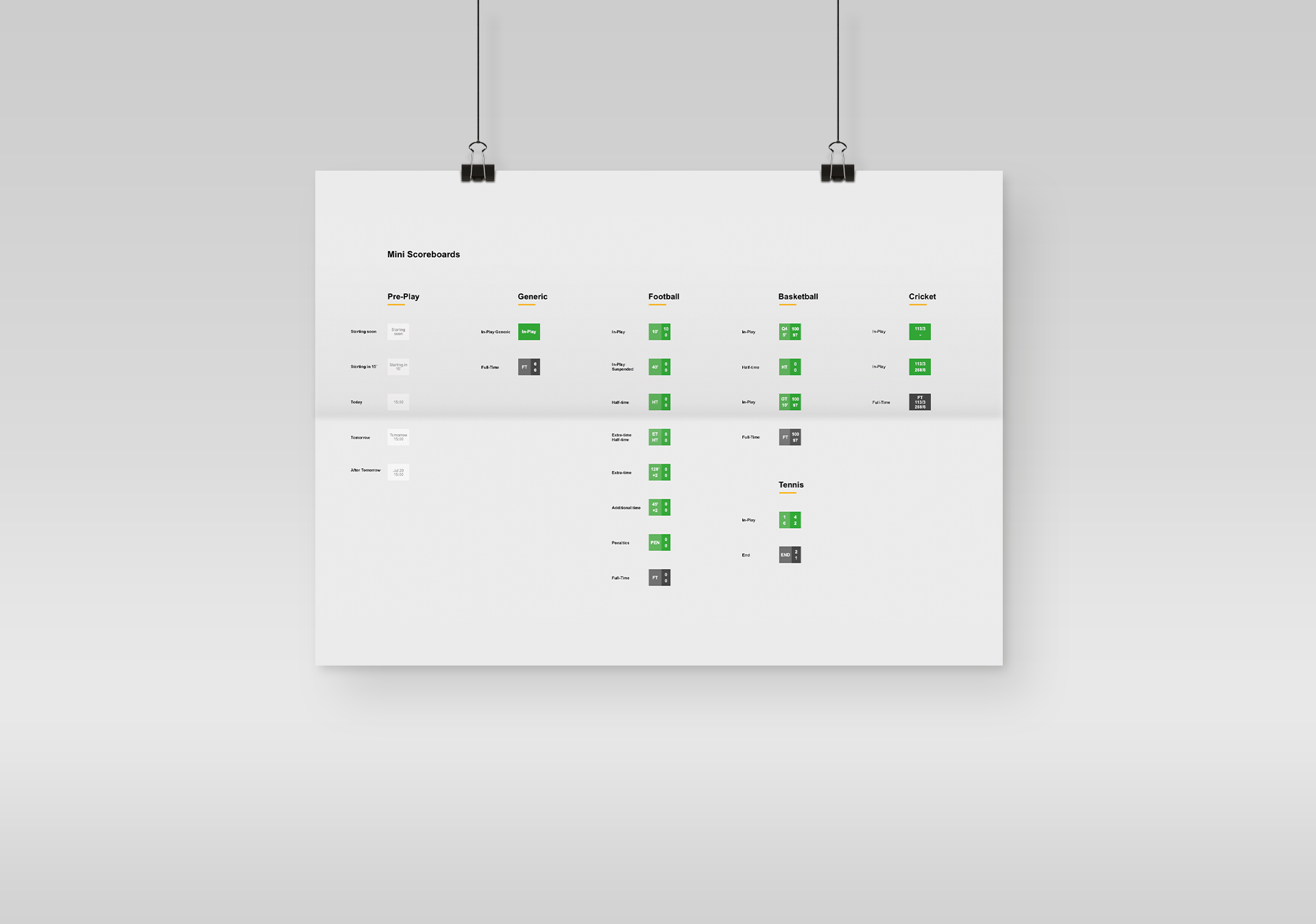
The molecule that proved to be one of the most challenging was the mini scoreboard. In this component, I had to fit a lot of information in a very reduced space. These scoreboards had to contain all of the information related to an in-play event. This information included time elapsed, scores, breaks, pre-match, post-match and edge cases like extra time, penalties, etc. They also had to accommodate all the different rules and structures of the many sports we featured. This was also one of the most reused and most relevant components in the whole product. After a lot of experimentation and testing, the following solution was defined.
In order to materialise the modularity of this structure, I decided to use a card based design approach, that gave a modern and clean look to the overall appearance of the product.
There were many challenges when it came to giving life to these wireframes. One of them was the presence of so many modules with so many controls and data within them, which made it very difficult to stand out the most important elements.
ORGANISMS
All of these molecules and more were used to create all of the different modules (organisms) that were laid out on every page, according to the structure templates that were defined in the wireframes.
Below is the final design of the homepage that was presented in the wireframe in the beginning. This page alone is composed of many different modules, related to different themes and sports, and all of them had to be presented in a clean and functional way. We can see the use of the defined molecules in every one of them, like tabs, cards, buttons, scoreboards and much more.
All of these molecules and more were used to create all of the different modules (organisms) that were laid out on every page, according to the structure templates that were defined in the wireframes.
On the right is the final design of the homepage that was presented in the wireframe in the beginning. This page alone is composed of many different modules, related to different themes and sports, and all of them had to be presented in a clean and functional way. We can see the use of the defined molecules in every one of them, like tabs, cards, buttons, scoreboards and much more.
Similarly to the homepage, these reusable elements were a part of the other pages of the product, reinforcing consistency and giving a better visual experience to the user.
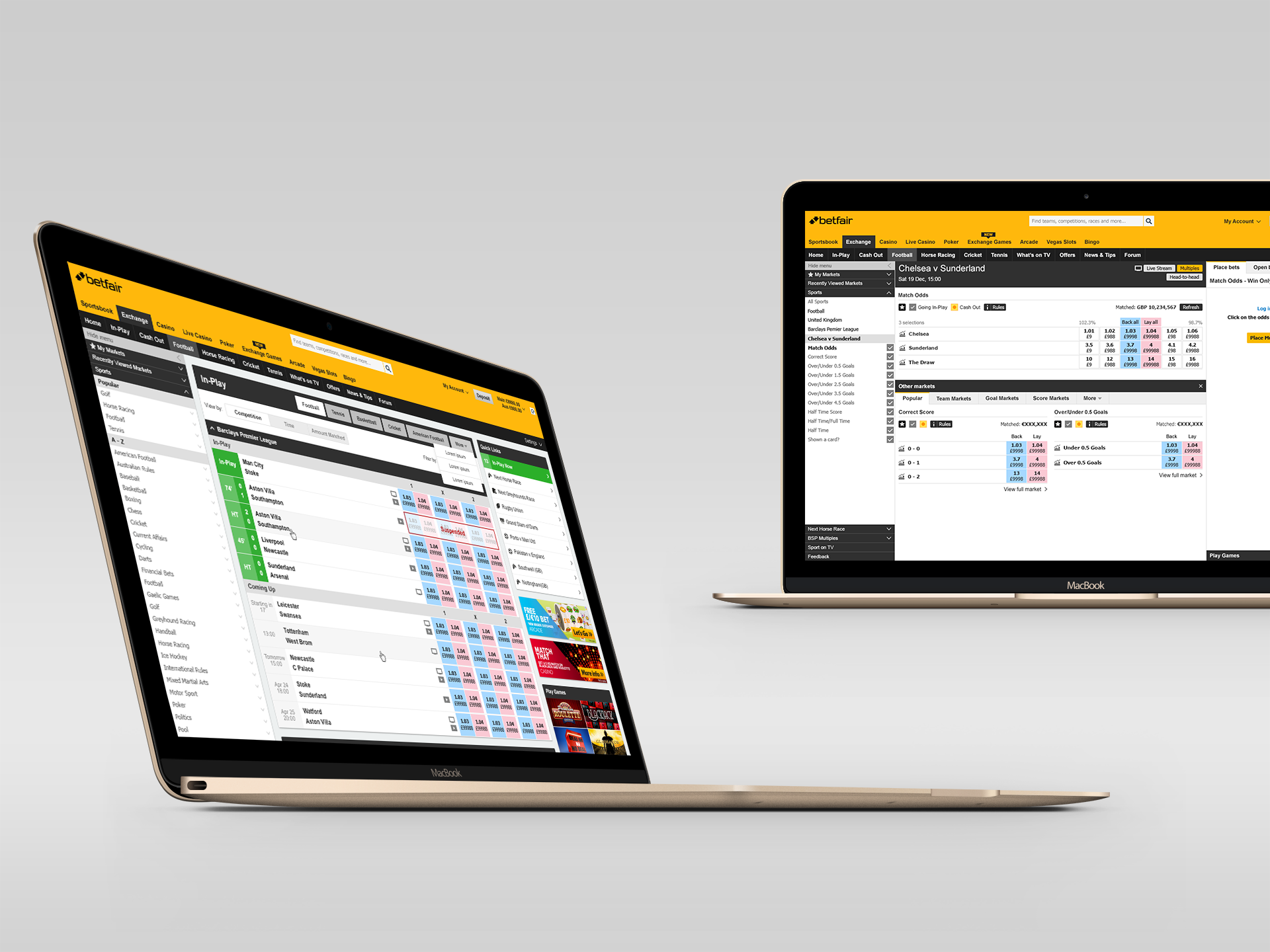
Here we can see the outcomes of the design of the in-play page and the football event page. Although these pages have very different purposes and modules, the presence of the reusable elements is very easily identifiable.
Similarly to the homepage, these reusable elements were a part of the other pages of the product, reinforcing consistency and giving a better visual experience to the user.
On the left we can see the outcomes of the design of the in-play page and the football event page. Although these pages have very different purposes and modules, the presence of the reusable elements is very easily identifiable.
DESIGN HANDOFF
We were working with 3 development teams, and it was our responsibility to deliver the outcomes of the UI design according to their needs. The atomic design approach made it easy to compile a well organised style guide.
I was also responsible for doing UAT of every user story on the dev teams' sprints. This proved essential to ensure that everything was according to the design specifications, resulting in a polished visual experience.
We were working with 3 development teams, and it was our responsibility to deliver the outcomes of the UI design according to their needs. The atomic design approach made it easy to compile a well organised style guide.
In my opinion, a style guide is an essential tool for the rest of the design team and also for development teams. Besides all of the elements and components already compiled, I also created a foundations document to detail colours, font sizes etc.
As for delivering the page designs and layout, we used a very powerful tool called Zeplin that automatically generated all of the design specifications for every design document. This automation saved the team a lot of time, that was used more efficiently on other tasks.
I was also responsible for doing UAT of every user story on the dev teams' sprints. This proved essential to ensure that everything was according to the design specifications, resulting in a polished visual experience.
SELECTED WORKS

UpholdProduct Design
OutsystemsDesign Leadership, Design Operations, Design Systems & Research Ops
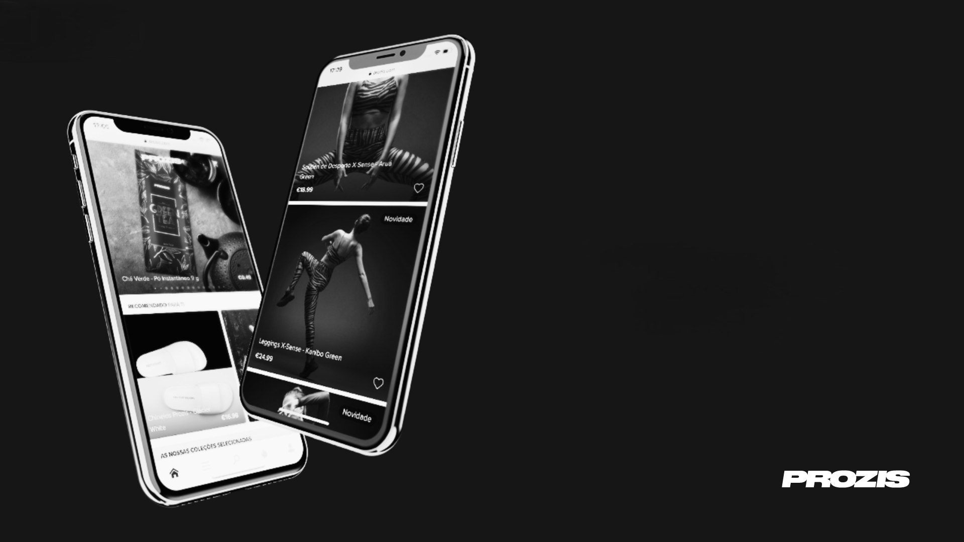
ProzisDesign Leadership, Product Design, Design Systems

The Scene ClubAndroid App
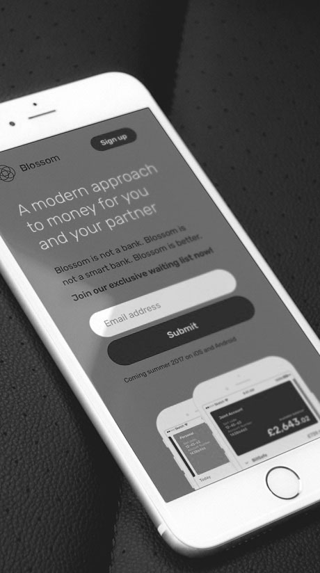
BlossomMobile App & Landing Page

Betfair ExchangeWeb App
PaybaseWebsite & Branding

EY MobilityWeb App
Made with ❤️ by Sónia Gomes @2024
Made with ❤️ by Sónia Gomes @2024
Get in touch!  +351 917 373 380
  hello@soniagomes.me